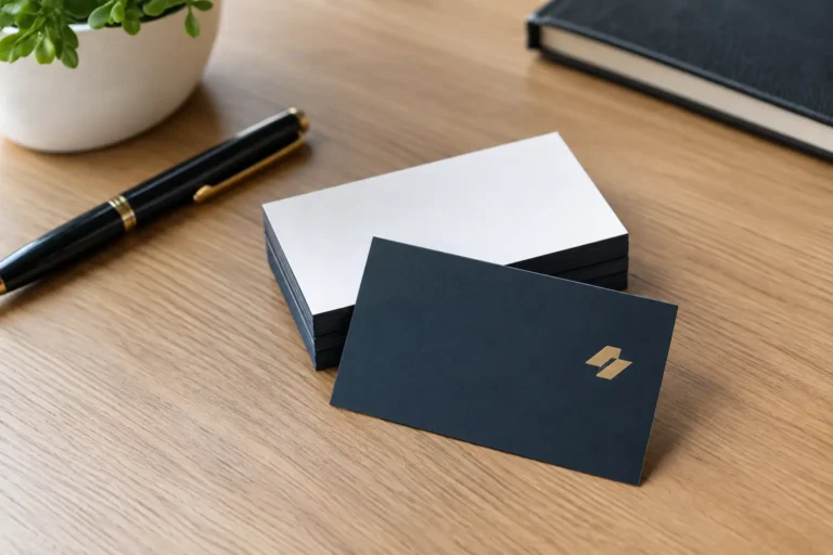

A handshake lasts seconds. A professional business card design can stay on a prospect’s desk, in a wallet, or next to a computer for months. That makes it more than a piece of stationery. It is a compact proof point that your business is established, prepared, and worth remembering.
For small businesses and growing brands, the challenge is not fitting more information onto a 3.5-by-2-inch card. It is deciding what deserves space. The strongest cards make the next step obvious while reinforcing the same visual identity people see on your website, social profiles, packaging, and proposals.
Start With the Job Your Card Needs to Do
A business card is not a brochure, a resume, or a menu of every service you offer. Its primary job is to help someone recall you and contact you after a real-world interaction.
That job can vary by business. A local contractor may need a phone number and service area to be immediately visible. A startup founder meeting investors may prioritize a clean name, title, company mark, and website. A real estate professional may need a portrait if face recognition is a meaningful part of how clients choose them.
Before discussing colors, paper, or special finishes, answer one question: what should the recipient do next? Call, visit your website, book an appointment, request a quote, or follow your work? The answer determines the card’s hierarchy.
Trying to make one card serve five different audiences often creates a crowded result. If your company has distinct customer groups, event-specific cards or role-based cards may be a better investment than a single overloaded design.
What a Professional Business Card Design Must Include
Most cards need a company logo, your name, your role, one primary contact method, and a website. That foundation is enough for many businesses. Add a physical address only if visiting your location is central to the customer experience, such as a retail store, clinic, restaurant, or office with regular appointments.
Choose contact details based on how customers actually reach you. A plumber who books work by phone should not hide the phone number below a tiny social media handle. A consultant whose sales process starts online may give the website or email more visual weight. Keep the information current and assign one person to review it before every print run.
A short descriptor can help when your company name does not explain what you do. “Residential Roofing,” “Tax Planning for Small Businesses,” or “Custom Cabinetry” can provide useful context. The key is restraint. One clear line is more effective than a paragraph of marketing language.
A QR code can be useful when it sends people to a dedicated page, scheduling tool, portfolio, or digital contact card. But it should not replace readable contact information. People may not want to scan a code in the moment, and a broken or outdated destination weakens trust fast. Test it on multiple phones before approving the final file.
Design for a Fast Read, Not a Long Look
People usually glance at a business card before deciding whether to keep it. Your design needs a clear reading order: first the brand, then the person, then the best way to make contact.
White space is one of the most practical tools in professional business card design. Empty space around a logo, name, or phone number is not wasted real estate. It directs attention and makes the card easier to read. A card packed edge to edge with text can feel less credible, even when every detail is technically relevant.
Use a limited type system. One typeface for headlines or names and another for supporting details is usually plenty. Decorative fonts can work for a carefully defined brand, but they should never make a name, URL, or phone number difficult to read. Small text also needs more breathing room than many business owners expect, especially when printed.
Color should come from your established brand palette, not from a trend you saw on another company’s card. A dark background with reversed white type can look sharp, but it requires careful production to retain crisp, readable details. Light backgrounds are often more forgiving and may be easier for recipients to write notes on. Neither approach is automatically better. The right choice depends on your brand, your industry, and the information density of the card.
Keep Your Brand Consistent Across Both Sides
Using both sides can create a polished experience, but only if each side has a purpose. One side might carry the logo and a simple brand statement, while the other handles contact information. Another approach places a bold logo and name on the front, with services and a QR code on the back.
Do not treat the reverse side as spare space that must be filled. A simple back can give the front more impact. This is especially true for premium service businesses, where confidence often shows up in what the brand chooses not to say.
Consistency matters beyond the card itself. If your business card uses a different logo, color palette, tagline, or tone than your website, customers may wonder which version of the company is current. Brand consistency helps a newer business appear organized and helps an established business stay recognizable as it grows.
Paper and Finishes Change the Message
Design does not end with the artwork. Paper stock, coating, and finishing affect how the card feels in a customer’s hand and how well it performs over time.
A thicker uncoated stock often feels approachable and substantial. It works well for professional services, home services, boutiques, and brands that want a tactile, grounded impression. Gloss coating can make colors appear more vivid, though it can produce glare and is harder to write on. Matte finishes are commonly chosen for their refined look and legibility.
Special finishes such as foil, embossing, spot gloss, painted edges, or unusual die cuts can make a memorable statement. They also add cost and can become distracting if they compete with the brand message. For a startup with a tight budget, investing first in a strong logo, readable layout, and quality stock usually delivers more value than an expensive effect.
Standard-size cards are practical because they fit wallets, card holders, and filing systems. Nonstandard shapes can stand out at a trade show, but they may be inconvenient to carry and more expensive to replace. Use an unusual format only when it genuinely supports the brand, not just because it is different.
Avoid the Mistakes That Make Cards Look Cheap
The most common issue is overcrowding. Too many phone numbers, email addresses, social handles, certifications, slogans, services, and disclaimers turn a useful card into a tiny information sheet. Prioritize one path to contact and let your website carry the rest.
Low-resolution logos are another credibility problem. A fuzzy image, pixelated icon, or poorly reproduced photograph signals inconsistency before a prospect reads a word. Your print file should use high-resolution artwork and the correct color settings for commercial printing.
Also watch the edges. Printers need a bleed area for background colors and images that extend beyond the trim line. Important text and logos need a safe margin inside the edge. A professional designer accounts for both, preventing a phone number from looking cramped or getting trimmed during production.
Finally, resist copying a competitor’s card too closely. Familiar industry cues can be helpful, but a business card should make your company recognizable, not interchangeable. Your colors, logo, personality, and customer promise should have room to come through.
A Better Design Process for Busy Business Owners
The fastest route to a better card is not opening a template and trying to make every decision alone. Start by gathering your approved logo files, brand colors, preferred contact information, and the one action you want customers to take. Then consider where the card will be handed out: at networking events, job sites, storefronts, client meetings, or conferences.
A professional designer can turn those inputs into a layout that feels intentional, print-ready, and consistent with the rest of your brand. The value is not just visual polish. It is having someone make smart decisions about spacing, production requirements, typography, and the trade-offs between what looks good on screen and what works in print.
Logoworks helps businesses build cards as part of a broader identity, so the finished piece supports the brand rather than becoming a disconnected one-off. You should also receive final files you can use confidently for future print runs. Your designs and rights should remain yours.
Before printing in volume, review the proof at actual size. Check every spelling detail, confirm URLs and phone numbers, and ask someone unfamiliar with the business whether they can identify your name, company, and primary contact method in a few seconds. A small proofing step can prevent a costly reprint.
Your card does not need to say everything about your business. It needs to make the right impression, give people a clear next move, and earn a place among the cards they decide to keep.