
Famous logos grace our everyday life. From Pepsi to Sony to Ford, we see logos everywhere, even if we’re just sitting at home quietly and watching TV. In fact, we memorize some of them we see them so much and can recognize many of them even if the words or the brand name aren’t included in the picture. In fact, they recently tested that theory and it was absolutely hilarious.
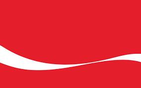
Even if you don’t drink this sugary delight, you probably can’t escape the fact that this is (one of) the Coca-Cola logos.
![]()
We get so used to some logos that we forget to actually look at them. We see cute logos and logos that look like dogs or pumas and that’s all we notice. And while this isn’t necessarily an important thing to do, designers have been slipping fun “easter egg” bits into their logos for decades for the audience’s enjoyment. Typically, these are clever things that people miss when they just look at a famous logo and have seen it a hundred times previous. Let’s make light of some old logos and see if they might make you smile upon a second look.
FedEx
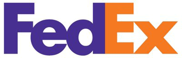
This is probably one of the best and most popular examples of a hidden image in a famous logo; if you look between the “E” and the “x”, you’ll see a lovely little arrow, which is meant to represent speed and accuracy.
Goodwill
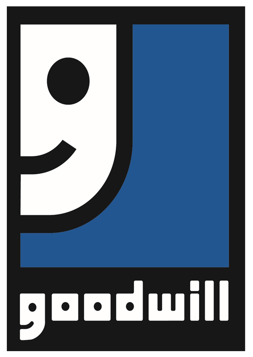
Personally, I have looked at this logo for years and never noticed this particular quirk: while I always saw the body of the logo as a smiling face, I never noticed its similarity to the “g” in “Goodwill”. This is cute, but smiley paired with a blue background indicates relief and contentment, making Goodwill look trustworthy and kind.
The Bronx Zoo
![]()
There’s a little bit of Bronx in each of us – or, in this case, in each giraffe. This clever design has to do with what the buildings inside of the zoo look like – they’re turn-of-the-century buildings, and are unique to the area. You can see this one between the older giraffe’s legs:
Hershey’s Kisses
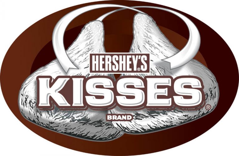
Pucker up for an extra kiss from this famous logo, which can be seen (with a tilt of your head) between the “K” and “I”. Muah! As far as we can tell, this is just a cute artist’s hidden kiss – there isn’t a reason beyond the utter delight of Kiss eaters everywhere.
Baskin Robbins
![]()
Baskin Robbins used to be two different companies that merged in 1948, and in 1953, the company hired an advertising company hat recommended the adoption of the number 31 (because at the time, they were offering 31 flavors, which was quite the legendary concept) and a typeface that reminded people of the circus. To this day, the typeface and colors remain reminiscent of acrobats and tiger training, even though circuses are all but gone. If you look closely, you’ll see the company’s root “31” in pink right in the middle of “BR” – to this day, each franchised location still serves 31 flavors.
Which famous logos have hidden meanings that you’ve noticed? Which NOT-famous logos have some interesting hidden goodness that you’d like to share?