
A logo can look perfect in a presentation and still create problems the first time you order a sign, sponsor an event, or update your website. The essential files for logo delivery are what turn an approved design into a working business asset – one your printer, web developer, social media manager, and future marketing partners can use correctly.
For small businesses, receiving the right files is not a technical extra. It protects the investment you made in your brand. Without them, routine tasks can lead to blurry graphics, wrong colors, unexpected redraw fees, and a logo that looks different from one customer touchpoint to the next.
Why logo file types matter after approval
Your logo has to perform in more places than a business card. It may appear on a storefront banner, an invoice, a mobile website, a staff shirt, a social profile, or a presentation deck. Each use calls for a different combination of file format, color mode, background, and size.
A common mistake is assuming one high-resolution PNG or JPG covers every need. Those files are useful, but they are not built for every job. A JPG can look fine on a screen and become soft or pixelated when enlarged for print. A logo with a white background may disappear on a light webpage. A printer may ask for a vector file that can scale cleanly to almost any size.
A professional delivery package anticipates these situations. It gives you practical options without forcing you to become a designer or guess which format belongs where.
The essential files for logo delivery
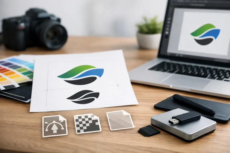
A complete logo handoff generally includes both vector and raster files. The difference is simple: vector files are made from mathematical paths and can scale without losing quality. Raster files are made from pixels and are best for specific digital sizes.
Vector files: the long-term foundation
AI, EPS, SVG, and PDF are the most common vector logo formats. You may not open these files often, but they are among the most valuable files in your package.
AI is the native Adobe Illustrator file. It is the editable working file designers use to update artwork, create new layouts, or prepare specialty production files. Keep it safely stored, even if you do not use Adobe software.
EPS is a widely accepted print-production format. Many sign shops, embroidery vendors, promotional product companies, and commercial printers request it because it preserves crisp vector artwork at large sizes.
SVG is especially useful for websites and digital products. It stays sharp on high-resolution screens and can often be resized by a developer without the quality loss associated with a JPG or PNG. Not every platform accepts SVG uploads, but it is an excellent file to have available.
PDF is a convenient, shareable vector format. Some print vendors prefer a print-ready PDF, and it gives you an easy way to view or send your logo when someone needs a high-quality version but does not use design software.
You do not necessarily need to send every format to every vendor. A reliable printer can tell you what they prefer. The key is owning the original vector options so you are never limited by a low-resolution image someone emailed years ago.
Raster files: ready for everyday use
PNG and JPG files cover many day-to-day marketing needs. They are straightforward to place in documents, upload to online platforms, and share with team members.
A PNG supports transparent backgrounds, making it ideal for websites, slide decks, social graphics, and digital ads. A transparent PNG lets your logo sit cleanly on a colored background, product photo, or website header without a visible white box around it.
A JPG is useful when a background is intentional or when a platform requires that format. It works well for simple web use, but it does not support transparency and is usually not the first choice for a logo that needs to appear over different backgrounds.
For raster files, size matters. Your delivery should include a high-resolution version for larger uses and web-friendly versions that load efficiently online. Bigger is not always better on a website, but starting with a properly prepared master file gives your team flexibility.
Color versions are not optional
A logo is not one file in one color. At a minimum, your delivery should account for where the logo will appear and what background it will sit on.
Your primary full-color logo is the version most customers will recognize. It should be provided in both RGB for screens and CMYK for print. RGB uses light and is designed for websites, email, social media, and digital displays. CMYK uses ink and is designed for brochures, packaging, stationery, and other printed pieces.
You should also receive a one-color black version and a reversed white version. The black version is useful for basic documents, invoices, stamps, and situations where full-color printing is not practical. The white version is essential for dark backgrounds, dark photography, uniforms, and signage.
Depending on the logo, a grayscale version may also be helpful. This is particularly useful for newspaper advertising, faxed documents, or low-cost print applications. If your business uses a metallic ink, embroidery, or specialty finishes, ask your designer or production vendor what alternate artwork is needed before placing an order.
Logo layouts should match real applications
Most brands need more than one logo arrangement. A horizontal logo may fit a website header or letterhead beautifully but be too wide for an Instagram profile, app icon, or square sponsorship placement.
A thoughtful logo package often includes the primary logo, a stacked or vertical version, and a standalone icon or brand mark when the identity supports one. The icon can be valuable for social profile images, favicons, packaging labels, and small digital spaces where the full company name would be unreadable.
These are not decorative extras. They help your brand stay recognizable when space is limited. Still, not every business needs every variation. If your logo relies entirely on a wordmark, forcing an unrelated icon into the package can create more confusion than value. The right set depends on the logo concept and the ways you plan to use it.
What a clean logo delivery folder looks like
File names should make sense to someone who did not create the logo. When a folder contains files named “final_final2” and “logo-new-use-this,” it becomes easy for the wrong version to circulate.
A clear delivery structure separates files by format or use, then identifies the color and layout in the file name. For example, a folder may include Print, Web, and Source Files, with names such as `BusinessName_Logo_Horizontal_CMYK.eps` or `BusinessName_Logo_White_Stacked.png`.
A useful package should contain these core items:
- Editable vector source files, such as AI and EPS
- Print-ready vector files, often EPS and PDF in CMYK
- Web-ready SVG files and transparent PNG files in RGB
- JPG files for platforms that require them
- Full-color, black, white, and any needed grayscale versions
- Horizontal, stacked, and icon variations when appropriate
This organization saves time later. Your staff can find what they need, and a vendor can start production without waiting for multiple rounds of clarification.
Brand guidelines and rights complete the handoff
Logo files work best when they are paired with simple usage guidance. Even a concise brand guide can show approved colors, font names, spacing rules, and examples of the correct logo versions for light and dark backgrounds. This keeps marketing materials consistent as your business grows and more people touch the brand.
Font information deserves special attention. A logo may include customized lettering, outlined artwork, or licensed fonts. If a font is needed for ongoing marketing materials, confirm whether you have the license to use it and whether it is included in the delivered assets. Fonts should not be casually shared or substituted without checking the license terms.
You should also receive clear confirmation of ownership rights for the final approved design. Your business needs the ability to use its logo across marketing, advertising, print, digital channels, and future brand materials. At Logoworks, that principle is straightforward: your designs and your rights belong to you.
Before you accept your logo package
Open a few files before the project is fully closed. Check that the PNG transparency works, the white logo is visible against a dark background, and the supplied PDF or SVG is not missing elements. If you have an upcoming printer or web developer, share the relevant files early and ask whether they need a specific format.
Keep the master delivery folder in a secure, backed-up location that your business controls. Do not rely on an old email thread or a former employee’s desktop. As your business adds vehicles, apparel, packaging, trade show materials, and new digital channels, those original files will continue to save money and preserve consistency.
The right logo delivery is a quiet advantage: when an opportunity appears, your brand is ready to show up clearly, professionally, and without delay.