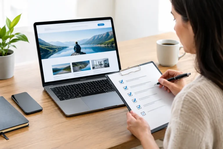

A customer lands on your website looking for your hours, services, pricing, or a way to contact you. If the text is hard to read, the navigation cannot be used with a keyboard, or a form gives no clear feedback, that customer may leave before they see the quality of your business. This website accessibility guide explains how small businesses can make their sites easier to use, more credible, and better prepared for a wider range of visitors.
Accessibility is not a design trend or a box to check at the end of a website project. It is part of how your brand communicates. A thoughtful, readable site tells customers that you respect their time and want to make doing business with you straightforward.
What website accessibility means for your business
Website accessibility means designing and building a site so people with disabilities can perceive, understand, navigate, and interact with it. That includes people who use screen readers, keyboard-only navigation, voice controls, browser zoom, captions, or other assistive technology. It also helps customers facing temporary or situational limitations, such as a broken arm, a noisy room, bright sunlight, or a slow connection.
For a small business, the practical goal is simple: no visitor should be blocked from learning about your company or taking a key action because of an avoidable design choice. They should be able to read your content, find what they need, submit a form, and understand what happens next.
Many teams use the Web Content Accessibility Guidelines, commonly called WCAG, as a working standard. You do not need to become an accessibility specialist to make meaningful improvements. You do need to treat accessibility as a business requirement alongside mobile usability, page speed, and clear branding.
Why accessibility supports trust and conversion
A polished website earns trust before a visitor reads a single testimonial. Clear type, logical menus, descriptive buttons, and well-organized pages all make a business feel more professional. Those same choices are central to accessibility.
The payoff is broader than compliance. A customer comparing several local providers may choose the site that feels easiest to use. Someone using a phone with enlarged text may spend longer on a page that does not break when zoomed. A shopper watching a product video in a waiting room may rely on captions. Accessibility removes friction from moments that can otherwise cost you a lead or sale.
There is also legal risk to consider. Website accessibility expectations can vary by business type, industry, location, and the services you offer. If your company has questions about legal obligations, speak with qualified legal counsel. From a design standpoint, the sensible approach is to build with recognized accessibility practices from the start rather than waiting for a complaint or costly rebuild.
Start with the pages that matter most
You do not need to overhaul every page in one week. Begin with the pages customers use to make decisions: your home page, primary service pages, contact page, online store, booking flow, and checkout or inquiry forms.
Walk through those experiences as if you were a first-time visitor. Can you identify what the business offers within a few seconds? Can you reach the main call to action without hunting for it? Can you complete the form and tell whether it was submitted successfully? This review often reveals problems that affect every customer, not only users of assistive technology.
Make navigation predictable
Keep your primary navigation in the same place across the site and use labels that describe the destination. “Services,” “About,” “Portfolio,” and “Contact” are clearer than vague labels such as “Explore” or “Learn More.” A button should also explain its result. “Request a Quote” is more useful than “Submit.”
Every interactive element should work with a keyboard alone. Visitors should be able to use the Tab key to move through links, menus, fields, and buttons, and the current focus should be visible. If you cannot see where you are on the page while tabbing, a keyboard user cannot confidently complete the task.
Use headings to create a real page structure
Headings are not just visual styling. Screen-reader users rely on them to scan a page and jump to relevant sections. Use one clear main page heading, then organize the rest of the content with headings in a logical order.
Avoid choosing heading sizes based only on appearance. If you need smaller text, adjust the visual styling while preserving the correct structure. A well-built page should make sense as an outline even before color, imagery, and layout are added.
Design for readability, not just appearance
Brand consistency matters, but accessibility asks brands to make a few practical choices about how their identity appears on screen. A subtle gray paragraph on a white background may look refined in a mockup while being difficult to read for many people. Small, tightly packed text can create the same problem.
Use strong contrast between text and its background, especially for body copy, navigation, and calls to action. Do not rely on color alone to communicate meaning. For example, if a form field has an error, pair the red outline with clear text that explains what needs to be fixed.
Choose a readable typeface, give body text enough size and line spacing, and leave room around important content. This does not mean every website must look generic. It means your logo, colors, and visual system need to work in real customer situations, not only in a design presentation.
Treat images and video as content
Images can reinforce a brand message, show completed work, or help customers understand a service. When an image conveys useful information, write alternative text that describes its purpose. An image of a finished kitchen renovation might be described as “Modern white kitchen remodel with wood island and pendant lighting,” not “image” or a string of keywords.
Decorative graphics do not need a long description. The distinction matters: describe what adds meaning and avoid forcing screen-reader users through content that adds nothing.
For video, provide captions for spoken content. If the video depends heavily on visual action, consider a transcript or audio description. A short brand video may not need the same treatment as a detailed product demonstration, so match the effort to the information customers need to receive.
Build forms customers can actually finish
Forms are where many accessible websites fail. Labels that disappear when someone starts typing, error messages that only change color, and confusing required fields can all prevent a lead from reaching you.
Place clear labels next to every field and identify required fields before submission. Ask only for information you truly need. If a visitor enters something incorrectly, tell them what happened and how to correct it in plain language. “Enter a valid email address” is helpful. “Invalid input” is not.
Make sure confirmation messages are specific as well. After a contact request, say that the message was received and set a realistic expectation for follow-up. That clarity improves the experience for everyone and reflects the reliable, human service your business wants to provide.
A practical website accessibility guide for ongoing work
Accessibility should become part of your regular content and design process. When you add a new landing page, publish a blog post, swap in a campaign image, or update a form, check the basics before it goes live.
Use this working review for major updates:
- Confirm text has sufficient contrast and remains readable when enlarged.
- Check that every page has a clear title and logical heading structure.
- Test menus, buttons, forms, and pop-ups with only a keyboard.
- Add useful alternative text to meaningful images and captions to applicable videos.
- Review links and buttons to make sure their labels describe the action or destination.
- Check forms for visible labels, understandable errors, and clear confirmation messages.
Automated testing tools can catch some common issues, such as missing alternative text or contrast problems. They are useful, but they do not replace human review. A tool may confirm that an image has alternative text without telling you whether that text is helpful. It cannot always judge whether your page flow makes sense to a customer trying to schedule a service.
If you are planning a redesign, bring accessibility into the conversation before colors and layouts are finalized. A design partner should ask how visitors will navigate, read, and convert, not simply deliver an attractive homepage. Decisions made early are usually faster and more affordable to implement than revisions made after development.
Your website is often the first member of your team a customer meets. Give it the clarity, care, and accountability you would expect from any customer-facing employee, and more people will have a fair chance to choose your business.