
A small business brochure gets judged fast – often before anyone reads a full sentence. A cluttered layout, weak headline, or off-brand look can make a capable business seem unprepared. Strong brochure design for small business is not about filling space with graphics. It is about earning trust, explaining value clearly, and giving people a reason to take the next step.
That matters whether your brochure sits at a front desk, gets handed out at a local event, arrives in a sales packet, or supports an in-person meeting. When it is done well, it becomes a practical sales tool. When it is done poorly, it creates friction your business does not need.
What brochure design for small business should actually do
Many owners start with the wrong question. They ask what the brochure should look like. The better question is what the brochure needs to accomplish.
For most small businesses, a brochure has three jobs. First, it should make the business look credible. Second, it should help the reader understand what you offer and why it matters. Third, it should guide the reader toward a clear action, whether that is calling, booking, visiting, or requesting a quote.
Those goals sound simple, but they shape every design choice. A polished brochure is not just visually appealing. It is organized around the reader’s decision-making process. That means the design has to support the message, not compete with it.
Start with the audience, not the fold
Before choosing a trifold, bifold, or multi-page format, get specific about who will read it. A brochure for a home services company should feel different from one for a law office, a daycare, or a wellness brand. The structure, tone, and level of detail should reflect what that audience needs in order to feel confident.
If your prospects are making quick comparisons, the brochure should make your differentiators easy to scan. If your service requires more trust and explanation, the design should allow room for process, credentials, and proof points. If the brochure will support a salesperson in meetings, it may need a different balance of imagery and text than one displayed in a retail setting.
This is where many small businesses lose momentum. They try to make one brochure do everything for everyone. A more focused brochure usually performs better because it respects context.
Layout matters because attention is limited
People do not read brochures from top to bottom the way they read a contract. They scan headings, glance at images, look for reassurance, and decide quickly whether the piece feels worth their time.
That is why hierarchy is one of the most important parts of brochure design for small business. The headline should say something meaningful right away. Subheads should break the content into useful sections. The most persuasive points should be easy to find without effort.
White space also matters more than many owners expect. Trying to squeeze every detail into one brochure often makes the result harder to read and less convincing. A clean layout signals confidence. It suggests your business knows what matters and how to communicate it.
Good layout choices include consistent spacing, clear section breaks, readable type sizes, and a natural flow from one panel or page to the next. None of that is flashy, but it is what helps a brochure feel professional.
Why too much information usually hurts
Small business owners often worry that leaving something out means losing a sale. In practice, saying too much can weaken the message. A brochure is not meant to answer every possible question. It should create clarity and momentum.
If your brochure lists every service variation, every feature, and every background detail, the reader may miss the main point. It is better to focus on what your ideal customer most wants to know: what you do, who it is for, why they should trust you, and what to do next.
Branding should feel consistent, not decorative
A brochure is one piece of a larger brand experience. If it looks disconnected from your website, logo, business card, signage, or sales materials, that inconsistency can make your business feel less established.
Strong branding in a brochure includes the obvious elements like logo use, color palette, and typography. But it also includes tone of voice, image style, and how your value proposition is framed. Consistency is what makes a business feel organized and reliable.
This does not mean every brochure should look restrained or formal. A children’s activity business may need bright colors and playful energy. A financial consultant may need a calmer, more structured presentation. The right style depends on the brand and the audience. What matters is that it feels intentional.
For growing companies, this is often where professional design support makes a real difference. A designer is not only arranging text and photos. They are translating your brand into a piece that feels aligned, persuasive, and ready to represent your business in the real world.
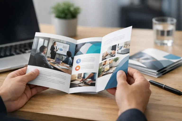
Images, copy, and credibility have to work together
Beautiful visuals alone will not carry a brochure. Neither will dense blocks of text. The best brochures create balance.
Images should support the message, not act as filler. That may mean product photography, team photos, before-and-after examples, or service-related imagery that helps prospects picture the outcome. Generic stock visuals can work in some cases, but if they feel staged or disconnected, they reduce trust instead of building it.
The copy should also earn its place. Strong brochure copy is concise, specific, and customer-focused. It explains benefits clearly without sounding inflated. Claims should feel believable. If you say your business is trusted, proven, or high quality, support that with something concrete, such as years in business, service volume, certifications, client types, or process details.
Credibility cues matter because brochures often reach people before a direct conversation happens. Design can attract attention, but proof is what helps move someone closer to action.
The call to action should be unmistakable
One of the most common brochure mistakes is ending without direction. If the reader finishes the piece and is not sure what to do next, the brochure has not done its job.
A strong call to action should be visible, simple, and appropriate to the buying stage. For some businesses, that means calling for a consultation. For others, it means visiting a showroom, requesting a quote, scheduling an appointment, or bringing the brochure into a store.
It is also worth thinking about how much commitment you are asking for. A high-trust, high-ticket service may need a softer next step than a quick-turn consumer offer. The right CTA depends on your sales process. What matters is clarity.
Print details are part of the design
Even the strongest layout can lose impact if production choices are an afterthought. Paper stock, finish, size, and fold all affect how the brochure feels in hand and how your brand is perceived.
Glossy stock may suit businesses that rely on vivid imagery, while a matte finish can feel more refined and easier to read. A heavier paper weight usually feels more substantial, but it also raises cost. Tri-fold brochures are familiar and practical, but they are not always the best choice for every message.
There is no single correct format. It depends on your content, budget, distribution method, and audience expectations. The best choice is the one that supports the message without making the piece harder to use.
When to update your brochure
If your brochure still shows old branding, outdated services, or messaging that no longer matches your business, it may be doing quiet damage. Prospects notice when materials feel stale, even if they cannot immediately explain why.
You should consider a refresh when your logo or brand identity has changed, your services have expanded, your audience has shifted, or your current brochure simply feels inconsistent with the quality of your work. Growth creates new expectations. Your materials should keep up.
For small businesses that want professional results without agency-level complexity, working with an experienced design partner can simplify the process. A company like Logoworks helps bridge that gap by pairing custom creative with a guided, structured approach that is easier to manage and easier to trust.
A brochure is not just a handout. It is a quiet representative of your business, speaking for you when you are not in the room. Make it clear, make it credible, and make sure it reflects the standard you want customers to expect.