
A startup website has a short window to earn trust. A visitor may arrive from a search result, a social post, a referral, or a paid ad, then decide within seconds whether your company feels legitimate. This startup website design guide focuses on the decisions that turn a new site from a digital brochure into a credible sales tool.
For most founders, the challenge is not simply choosing colors or picking a website platform. It is translating a business idea into clear messaging, a consistent visual identity, and a simple path for customers to take action. The strongest startup sites make that work look easy because every page has a purpose.
Start With the Job Your Website Must Do
A website cannot be everything at launch. Trying to explain every feature, serve every audience, and answer every possible question usually creates a crowded experience that converts poorly. Start by defining the primary action you want visitors to take.
For a service business, that might be requesting a quote or scheduling a consultation. For a software startup, it could be booking a demo or starting a trial. An ecommerce brand may need visitors to shop a featured collection. The goal should shape the home page, navigation, calls to action, and supporting content.
Then identify the audience most likely to take that action first. A founder selling payroll software to small companies, for example, should not speak to every business owner in the country. It is more effective to address the specific frustrations of the people who buy, use, or influence the purchase of payroll software.
Clear priorities prevent a common startup mistake: designing a beautiful site before deciding what it needs to accomplish.
Build the Message Before You Design the Page
Design gives your message credibility, but it cannot rescue vague copy. Before creating wireframes or selecting imagery, define the core promise your business makes to customers.
Your home page headline should quickly answer three questions: what do you offer, who is it for, and why should someone care? “Better solutions for modern businesses” sounds polished but tells visitors almost nothing. “Custom bookkeeping for construction companies that need job-level clarity” is more specific, more useful, and easier to trust.
Support that headline with a brief explanation of the outcome you provide. Focus on the customer’s problem before listing your features. Visitors care about features when they understand how those features save time, reduce risk, improve results, or make a difficult task easier.
Your site should also anticipate the objections that slow decisions. Early-stage companies often have less market recognition, so proof matters. Depending on your business, that proof may include client testimonials, case studies, certifications, years of relevant experience, industry partnerships, product results, or a clear explanation of your process. Do not invent authority. Present the evidence you have honestly and make it easy to find.
Create a Brand System That Looks Intentional
A startup does not need a massive brand book to look established. It does need consistency. A professionally designed logo, defined color palette, typography choices, image direction, and voice guidelines create a visual system that can carry across your website, social profiles, sales materials, and customer communications.
Consistency is especially valuable when your company is new. When each page uses different fonts, stock photography styles, button treatments, or tones of voice, visitors may assume the business is still figuring itself out. That perception can cost you leads, even when your product or service is strong.
Your visual identity should fit the position you want to own. A financial service may need a restrained palette and direct language that signal confidence. A family-focused consumer brand may benefit from warmer colors and more expressive imagery. Neither approach is universally right. The right choice is the one that supports your audience’s expectations while making your company recognizable.
Professional design is not about making every page look expensive. It is about making every interaction feel considered.
Organize Pages Around Customer Questions
Most startup websites need a focused set of core pages, not an oversized menu. The exact structure depends on the business, but visitors usually need to understand your offer, see why they should trust you, and know what to do next.
The home page should introduce the value proposition and guide visitors toward the next step. Service or product pages should explain what customers receive, who it is for, how it works, and why it is worth choosing. An about page can establish the people, experience, and values behind the company. A contact page should remove friction with clear options for getting in touch.
If you serve distinct customer groups or industries, dedicated pages can help you speak more directly to each audience. However, do not create nearly identical pages just to fill out the site. Each page should offer a meaningful reason to exist, whether that is a different use case, service, location, or customer need.
Navigation should be plain and predictable. Clever labels can create confusion. “Services,” “Solutions,” “Pricing,” “About,” and “Contact” are easy to understand. If your offer requires more education, use the page itself to provide context instead of making visitors decode the menu.
Design for Conversion, Not Just Appearance
A high-performing site directs attention. It uses hierarchy to show visitors what matters first, what supports that message, and what action to take. Strong headlines, readable body copy, clear spacing, and prominent buttons are not decorative details. They help customers make decisions with less effort.
Every important page should include a clear call to action. Use specific language when possible. “Request Your Free Estimate” is more useful than “Submit.” “Book a Product Demo” is more direct than “Learn More.” Repeating a call to action is often appropriate on longer pages, as long as it follows information that builds confidence rather than interrupting the experience.
Avoid asking for too much too soon. A contact form with ten required fields can discourage a visitor who is still evaluating options. Collect the information your team truly needs to begin the conversation. You can gather additional details after the initial inquiry.
Price is another decision point. Some startups benefit from publishing pricing because it qualifies leads and answers a major question quickly. Others sell complex, customized offerings where a fixed price would be misleading. In that case, explain what influences cost and what prospects can expect from the sales process. Clarity builds more trust than hiding the issue.
Make Mobile Performance a Non-Negotiable
Many customers will first see your startup on a phone. If text is difficult to read, buttons are too small, forms are frustrating, or pages load slowly, you can lose a qualified prospect before they see your offer.
Mobile-first design does not mean shrinking a desktop layout. It means checking that each page works naturally on smaller screens. Headlines should remain readable, navigation should stay simple, images should support the content rather than push key information down the page, and forms should be easy to complete with a thumb.
Speed matters, too. Large uncompressed images, unnecessary animations, and overloaded plugins can make a site feel unreliable. A visual effect may be worth using if it clarifies a product or strengthens the brand experience. If it slows the page without serving a customer need, leave it out.
Plan for Growth Without Overbuilding
Founders often face two opposite risks: launching a bare-bones site that does not build confidence, or delaying launch while trying to create every future page and feature. A better approach is to build a strong foundation that can expand.
Choose a website platform your team can realistically manage, or partner with a design team that can support updates as your business develops. Establish reusable page styles, button treatments, content blocks, and image guidelines so additions look like part of the same brand. Keep ownership of your final design files and brand assets so your business is not locked into a vendor relationship.
Your first version should be polished where it counts: your offer, proof, key pages, mobile experience, and conversion path. Blog libraries, resource centers, detailed integrations, and advanced personalization can come later if they support real business goals.
Review Before You Launch
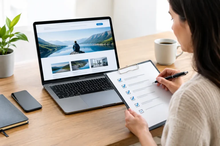
Before publishing, test the site like a first-time customer would. Read the headline without relying on your internal knowledge. Can you tell what the company does? Try the forms on desktop and mobile. Check every button, phone number, and email address. Ask someone outside the business to find a specific service or complete a key action.
Also review the small details that shape trust: spelling, image quality, consistent capitalization, readable contrast, accurate legal information, and updated social profiles. A single broken link will not always lose a sale, but a pattern of small errors can make a young business feel less dependable.
A startup website should evolve as you learn what customers ask, where visitors leave, and which messages create inquiries. Begin with a clear promise and a professional foundation, then let real customer behavior guide the next improvement. When your website reflects the quality of your business, it gives every marketing effort a stronger place to land.