
A customer may meet your business on a phone screen, in a Google result, through a referral, or on a business card left at a local counter. In each case, they make a fast judgment: does this company look credible enough to trust? The most useful small business branding trends for 2026 are not about chasing visual fads. They are about making that answer an easy yes.
For small businesses and growing brands, strong branding has to work harder than it does for a household name. It must explain who you are, create a professional first impression, and stay consistent as new marketing channels, products, and team members are added. Here are seven trends worth paying attention to, along with the practical choices behind them.
1. Distinctive simplicity is replacing generic minimalism
Clean design is still effective, but clean should not mean anonymous. For years, many businesses adopted the same formula: a thin sans-serif font, a muted color palette, and a simple icon that could belong to almost anyone. The result often looks polished at first glance but becomes forgettable when placed beside competitors.
The shift is toward distinctive simplicity. A logo may still be straightforward, but it has one ownable detail: an unexpected letterform, a stronger color choice, a custom symbol, or a confident type treatment. Brand systems are becoming simpler to use while gaining more personality.
For a small business, this is a smart trade-off. You do not need an overly elaborate mark that disappears on a social profile or embroidered uniform. You need a clear identity with enough character to be recognized again. A good test is whether someone could cover your business name and still tell that the design belongs to you.
2. Brand systems matter more than a logo alone
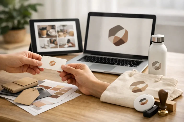
A logo is foundational, but it cannot carry every customer touchpoint by itself. One of the strongest small business branding trends is the move from one-off logo files to usable brand systems. Business owners are asking for the practical pieces that keep their presence consistent: color specifications, typography, social media templates, email signatures, business cards, website graphics, and presentation materials.
This matters because inconsistency can quietly weaken trust. A polished logo paired with mismatched social posts, improvised flyers, and a dated website sends mixed signals. Customers may not identify the issue as branding, but they notice when a business feels organized versus scattered.
A complete identity should be built around real use cases. A restaurant may need menus, signage, and loyalty cards. A B2B consultant may need proposal templates, a landing page, and LinkedIn graphics. A home services company may need vehicle decals, uniforms, and estimate forms. The right system depends on how and where customers encounter your business.
3. Human-made design is becoming a stronger trust signal
AI tools can generate quick images and rough concepts, and they have a place in early brainstorming. But businesses are learning that speed is not the same as strategy. Generic AI output often creates familiar-looking icons, unusable type, and visual choices that do not reflect the company behind the brand.
Customers also respond to brands that feel considered. That does not require a long brand manifesto or an expensive agency engagement. It means the visual identity should reflect actual decisions about your audience, positioning, personality, and market.
The best approach is often a combination of efficient tools and accountable human expertise. A professional designer can ask the questions a template cannot: What makes your offer different? What concerns do your customers have before buying? Where will this logo appear most often? Those answers shape design that supports a business goal, not just a style preference.
4. Personality is showing up in more purposeful ways
Small businesses no longer need to sound like scaled-down corporations. In fact, one advantage of a smaller company is that customers can feel the people behind it. More brands are using a clear visual and verbal personality to make their service memorable, whether that personality is friendly, direct, refined, energetic, or quietly expert.
The key is purpose. A playful illustration style may help a family-focused business feel welcoming. A precise, restrained identity may better serve a financial firm, law office, or premium contractor. Personality should reinforce what customers need to believe about you.
This is where visual identity and messaging need to agree. If your website promises white-glove service but your graphics look rushed, the message loses force. If your brand uses bold, modern visuals while your copy is full of jargon, the experience feels disconnected. Consistency does not mean every asset looks identical. It means every asset feels like it comes from the same business.
5. Accessibility is becoming part of professional brand design
Accessibility is not just a compliance conversation for large organizations. It is a practical standard for any business that wants more people to understand and use its marketing. Better contrast, legible typography, clear navigation, and readable text sizes make a brand easier to engage with across devices and audiences.
This trend also improves everyday usability. Light gray text may look sophisticated in a mockup, but it can be difficult to read on a phone outdoors. Decorative scripts may work in a logo, but they should not carry important details on a brochure or website. A color palette needs enough flexibility to work in print, on screen, and in black and white.
Accessible choices are rarely limiting when they are considered from the beginning. They give your business more reliable tools and reduce the need to redesign materials later.
6. Local credibility is getting a more polished look
Local businesses compete with national chains, online marketplaces, and well-funded startups. That makes credibility especially valuable. Customers want the convenience and confidence of a professional brand, while still wanting the personal connection of a local provider.
The strongest local brands are reflecting both. They use professional photography, clear service descriptions, consistent reviews and reputation messaging, and visual materials that look as good in a neighborhood mailbox as they do on a mobile screen. They may reference their community, but they avoid relying on clichés that make every local business look the same.
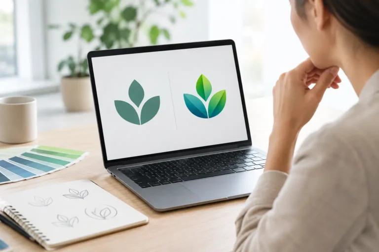
For example, a regional landscaping company does not need a leaf icon simply because it works outdoors. It may be better served by a distinctive mark, a memorable color system, and straightforward language that communicates reliable service. The goal is not to look bigger than you are. It is to look established, capable, and easy to choose.
7. Flexible brand assets are built for constant use
Your brand now needs to perform in many sizes and formats. A logo that looks good on a website header may fail as a social avatar. A detailed brochure graphic may not translate to a short-form video thumbnail. This is why adaptable assets are becoming a standard part of professional branding.
A flexible identity often includes a primary logo, a simplified logo variation, a standalone icon or monogram, approved color combinations, and clear rules for typography and spacing. These are not unnecessary extras. They help you move faster when opportunities arise without creating a new look every time.
Ownership matters here, too. Small business owners should receive final files that are organized, usable, and fully theirs. You should not be dependent on a designer or platform every time you need to print a sign, update a presentation, or create a new campaign.
How to choose the right branding trend for your business
Not every trend deserves a place in your brand. The right question is not, “What are competitors doing?” It is, “What will help our customers recognize us and trust us faster?” Start with the gaps that affect business results. If your visuals are inconsistent, prioritize a brand identity system. If customers struggle to understand your offer, align your messaging and website design before investing heavily in more content.
It also helps to separate a timely style choice from a long-term brand decision. A campaign can use a current design treatment. Your core logo, colors, and typography should be able to serve you for years. Trend-aware branding is not trend-dependent branding.
For businesses that want professional direction without agency-level complexity, a guided design process can make the difference. Logoworks pairs custom creative work with dedicated project management, so business owners can make confident choices without having to become design experts themselves.
Your next brand update does not need to be dramatic. It needs to be intentional. Choose the details that make your business easier to recognize, easier to trust, and ready for the next customer who finds you.