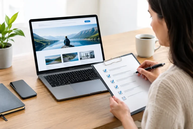

A landing page has one job: move a visitor toward one clear action. That may be requesting a quote, booking a consultation, starting a trial, or making a purchase. When learning how to design a landing page, the goal is not to fit everything your business does onto one screen. It is to make the next step feel obvious, credible, and worth taking.
For a small business or growing brand, that focus matters. You may only get a few seconds to show a prospect that you understand their problem and can deliver a professional result. Strong landing page design gives your offer the clarity and polish it needs to compete with larger companies, without making the visitor work to find the point.
Start With One Audience and One Goal
Before choosing colors, images, or a page layout, decide who the page is for and what you want that person to do. A landing page for homeowners seeking emergency plumbing should not look or read like a page for a software buyer comparing annual plans. Their urgency, questions, and decision process are different.
Write down the primary conversion goal in a simple sentence: “We want qualified local business owners to request a website design consultation.” That sentence should guide every major decision on the page.
Trying to satisfy several audiences at once usually weakens the message. If you offer multiple services, create separate landing pages for each core offer or campaign when possible. A dedicated page gives you room to speak directly to the visitor’s needs instead of relying on broad, generic claims.
Lead With a Clear Value Proposition
Your headline is not the place for clever wording that makes visitors guess what you offer. It should quickly explain the outcome, the audience, or the problem you solve. A visitor should be able to understand the basics without scrolling.
For example, “Professional Bookkeeping for Growing Construction Companies” is clearer than “Financial Confidence Starts Here.” The second line may be useful supporting copy, but it cannot carry the page alone.
A useful value proposition answers three questions:
- What are you offering?
- Who is it for?
- Why should the visitor choose it?
Place a short supporting paragraph beneath the headline to add the details the headline cannot hold. This is a good place to reduce friction by mentioning practical benefits such as fast turnaround, transparent pricing, local expertise, or dedicated support. Keep it specific. “Custom brand identity with a dedicated project manager and full ownership of final files” builds more confidence than “high-quality design solutions.”
Design the First Screen Around the Next Step
The first visible section of the page should contain your headline, a short explanation, a prominent call to action, and a visual that supports the offer. On mobile, visitors may see these elements in a different order, so test the page on a phone before approving it.
Your call to action should say what happens next. “Get My Free Estimate,” “Book a 15-Minute Call,” and “See Available Packages” are stronger than a vague “Submit” or “Learn More.” Use the same primary action throughout the page so visitors are not forced to choose among competing paths.
Contrast helps the button stand out, but it should still fit your brand. A bright button can attract attention, yet a color that clashes with the rest of the page can make the business feel less established. The best choice is usually a brand-aligned color that is clearly distinct from the background and surrounding text.
Build Trust Before You Ask for Commitment
Most landing page visitors do not know your business well enough to act on a promise alone. They need proof that you are legitimate, capable, and easy to work with. This is especially true for higher-priced services, new brands, and businesses asking visitors to share contact information.
Use proof points that are relevant to the decision. Customer testimonials, project examples, recognizable client industries, review ratings, years in business, certifications, guarantees, and clear process details can all help. The key is credibility, not decoration. A wall of generic logos or an anonymous quote will not do much to address a buyer’s concern.
Place trust signals close to moments of hesitation. If a visitor is about to complete a form, reassure them with a short privacy note or a statement about response times. If your service has a defined process, show the key stages before asking for a consultation. People are more likely to move forward when they understand what will happen after they click.
For creative services, show the work. A polished portfolio sample often communicates quality faster than a paragraph of claims. Make sure examples match the type of client or project you want to attract. A restaurant owner will respond better to relevant hospitality branding examples than to unrelated corporate work.
Use Visual Hierarchy, Not Visual Noise
Good landing page design directs attention. Visitors should naturally move from the headline to the benefit, then to proof, then to the call to action. White space, typography, image placement, and section order all contribute to that path.
Avoid treating every element as equally important. If every heading is oversized, every button is brightly colored, and every section uses a different background treatment, the page becomes harder to scan. Give the strongest visual emphasis to the offer and primary action. Let supporting information do its job without competing for attention.
Use a limited set of brand colors and type styles. Consistency makes a business look organized and dependable, while random fonts and mismatched graphics can create doubt. This does not mean every landing page must be minimal. A product with technical details may need diagrams, feature comparisons, or demonstrations. The design should match the complexity of the purchase, not follow a one-size-fits-all layout.
Images deserve the same scrutiny as copy. Generic stock photos can fill space, but they rarely make a unique case for your business. Whenever possible, use real team photography, product images, completed project examples, or custom illustrations that reinforce your offer. If you use stock photography, choose images that feel believable and aligned with your customer.
Keep the Page Easy to Scan and Easy to Use
Landing pages are read in fragments. Visitors scan headlines, button labels, highlighted benefits, and images before they decide whether the page deserves more attention. Short paragraphs and descriptive subheadings help them find what matters without feeling overwhelmed.
A common mistake is hiding essential details behind too much scrolling or clever interaction. Your price range, service area, turnaround expectation, or key qualification may not belong in every hero section, but it should be easy to find. Clear information can filter out poor-fit leads while helping serious prospects feel ready to contact you.
Forms should ask only for information you need at that stage. For a first consultation, a name, email address, phone number, and brief project description may be enough. Asking for a full company history, budget breakdown, and multiple uploads before the first conversation can reduce submissions.
Mobile usability is not optional. Buttons need enough space to tap, text must remain readable without zooming, and forms should be simple to complete on a small screen. A desktop layout that looks polished can still lose conversions if the mobile experience feels cramped or slow.
Answer Objections With Useful Copy
The strongest landing pages anticipate the questions a buyer is already asking. Is this right for my business? How much will it cost? How long will it take? What makes this provider different? What happens if I need changes?
You do not need to turn the page into a full brochure. Instead, address the most common objections in concise sections near the offer. A brief “How It Works” section can reduce uncertainty for service businesses. A pricing starting point can help visitors self-qualify. A guarantee or revision policy can make a first purchase feel less risky.
Be careful with claims that sound impressive but say little. “Best-in-class” and “industry-leading” may be familiar phrases, but they do not prove anything on their own. Replace them with details your business can stand behind: the number of concepts included, the response window, the experience of your team, or the rights customers receive when a project is complete.
Measure, Improve, and Protect What Works
No landing page is finished because it has been published. Watch how visitors use it. Look at conversion rate, form completion rate, traffic source, scroll behavior, and the quality of leads generated. A page with fewer submissions may still be more valuable if those submissions are better qualified.
Test one meaningful change at a time. You might compare two headlines, shorten a form, move testimonials higher on the page, or clarify the call to action. Changing the headline, offer, design, and form all at once makes it difficult to know what improved performance.
Do not chase every design trend. Animation, oversized type, and unconventional layouts can work for some brands, but only when they make the offer easier to understand. For most small businesses, clarity, speed, and trust will outperform a page designed mainly to look fashionable.
A well-designed landing page gives a potential customer the confidence to take one small step toward your business. Make that step clear, support it with evidence, and present it with the same care you bring to the service you are asking them to buy.