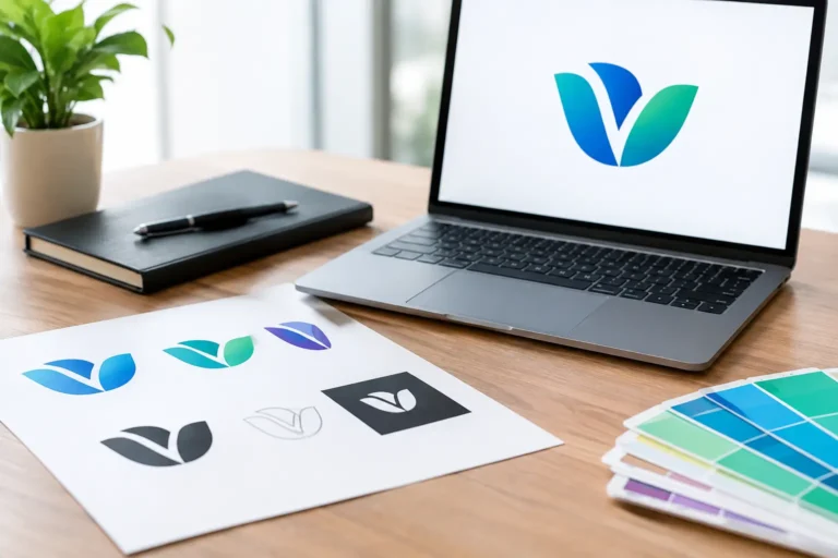

Your new logo may look perfect in the final presentation, but the files behind it determine whether it still looks professional on a storefront sign, a social profile, a business card, or a vendor’s invoice. Professional logo files explained simply: you need more than one image of your logo. You need a practical file set that gives your business control, consistency, and room to grow.
A logo is not a one-size-fits-all asset. The file that works beautifully on your website may look blurry when printed on a brochure. The file a screen printer needs is different from the one your web developer needs. Understanding the basics helps you avoid last-minute scrambling, expensive redraws, and branding that looks different from one customer touchpoint to the next.
Professional Logo Files Explained: Vector vs. Raster
The most useful distinction is between vector and raster files. They may contain the same logo, but they are built differently and used for different purposes.
A vector file is created from mathematical paths rather than a fixed grid of pixels. That means it can be scaled from a tiny pen imprint to a large trade show banner without becoming fuzzy or distorted. Vector files are the foundation of a professional logo package because printers, sign shops, embroiderers, and promotional product vendors often rely on them.
Common vector formats include AI, EPS, SVG, and PDF. Adobe Illustrator files, or AI files, are typically the original editable working files. EPS files are widely accepted by commercial printers and vendors. SVG files are especially useful for websites because they remain crisp at any screen size. A properly prepared PDF can also be a convenient vector option for print partners.
A raster file is made of pixels. PNG, JPG, and GIF are raster formats. They are useful for everyday placement in documents, email signatures, social posts, and websites, but they have size limits. Enlarge a small JPG for a banner, and the pixels become visible. That soft, jagged look can make a well-designed logo appear unprofessional.
The practical rule is straightforward: use vector files when the logo may need to scale, print, or be reproduced by another vendor. Use raster files when you need a ready-to-place image for a specific digital use.
The Logo File Types Your Business Will Actually Use
Not every business owner needs to open an AI or EPS file personally. What matters is having the right files available when a vendor asks for them. A complete package should make common tasks easier, not leave you guessing which attachment to send.
Here is how the most common formats fit into day-to-day business use:
- AI: The editable Adobe Illustrator source file. Keep this secure as part of your permanent brand archive. It is valuable when a designer needs to create new branded materials later.
- EPS: A versatile vector file often requested for printing, signage, apparel, and promotional products.
- SVG: A web-friendly vector format that stays sharp on responsive websites, apps, and digital interfaces.
- PDF: Often used to share a print-ready logo with vendors. PDFs can be vector-based, but it is wise to confirm with the person requesting the file.
- PNG: A high-quality raster image that supports transparent backgrounds. It is usually the best choice for placing a logo over a colored webpage, photo, presentation, or digital graphic.
- JPG: A compact image format best suited to situations with a solid background, such as some document headers or online directories. JPGs do not support transparency.
There is no single “best” logo file. A PNG may be exactly right for a LinkedIn banner, while an EPS is the right answer for a storefront window decal. The value comes from having professionally prepared versions ready for both situations.
Color Files Matter as Much as File Formats
A logo file is not truly complete if it only exists in one color treatment. Your brand needs flexibility while staying recognizable.
Most businesses should receive a full-color version, a black version, a white or reversed version, and, where relevant, a one-color version. The full-color logo is usually used on white or light backgrounds. The white logo is designed for dark backgrounds, photos, and colored surfaces. A true black version helps when color printing is not practical or when a clean, minimal application calls for it.
Color mode matters, too. Screens use RGB – red, green, and blue light. Commercial printing uses CMYK – cyan, magenta, yellow, and black ink. A logo that looks bright on a laptop can shift slightly when printed because inks and screens reproduce color differently.
That does not mean every project requires a separate design. It means your designer should prepare the logo appropriately for the intended use. If color matching is especially important for packaging, signage, or large print runs, your business may also need Pantone color references. Pantone is a standardized color-matching system that helps printers reproduce a specific brand color more consistently across materials.
Why Transparent Backgrounds Save Time
One of the most common file requests from business owners is, “Can I get the logo without the white box around it?” What they usually need is a PNG with a transparent background.
Transparency lets your logo sit naturally on a colored website section, a presentation slide, a social media graphic, or a photo. A JPG cannot do this because it always includes a background layer. If you place a white-background JPG onto a dark design, the white rectangle will show.
Still, transparency is not always the correct choice. If your logo includes fine white details, placing it over a busy photo can reduce readability. A professional brand package should include versions designed for light and dark backgrounds, rather than expecting one file to work everywhere.
What “Editable” Really Means
Many logo packages promise editable files, but that phrase can be misunderstood. An editable source file means a qualified designer can adjust the artwork in professional software. It does not necessarily mean every business owner should edit it themselves.
That distinction protects your brand. Changing font spacing, colors, or proportions without design controls can create inconsistency quickly. The editable file gives you long-term freedom: you are not trapped if you need a new brochure, vehicle wrap, trade show display, or website update. But it is usually best to let a designer handle changes that affect the logo itself.
Just as important, make sure you receive full ownership and copyright rights to your final logo. Your business should be able to use its logo across marketing, print, merchandise, digital channels, and future brand materials without uncertainty. Keep your final files stored in a shared company folder with clear access for the people who manage your marketing, website, and vendors.
How to Organize Your Logo Files Without Confusion
A well-organized logo folder prevents the familiar cycle of searching through old emails for “the right one.” File names should make the version and purpose easy to identify at a glance.
For example, use names such as `CompanyName_Logo_FullColor_RGB.png`, `CompanyName_Logo_White.png`, or `CompanyName_Logo_Black_CMYK.eps`. Avoid relying on vague labels like “final,” “final-final,” or “new logo.” Months later, those names tell no one which file is approved for what.
It also helps to separate folders by file type or use case: source files, print files, web files, and social media assets. If your logo includes an icon, a horizontal layout, a stacked layout, or a tagline version, label each one clearly. These variations are not unnecessary extras. They give you options without forcing the logo into spaces where it does not fit.
What to Send When a Vendor Asks for Your Logo
When a printer, sign company, or merchandise vendor asks for a logo, send the vector file first if they accept it. EPS or AI is often preferred, with a vector PDF as another useful option. Ask the vendor what format they need if the request is unclear. A reliable vendor will be specific.
For a website, share SVG when possible, along with PNG backups for places that need a simple image upload. For social media, a high-resolution PNG is typically the most practical choice. For a Microsoft Word document, presentation, or email signature, PNG generally provides a cleaner result than JPG, especially if the logo needs a transparent background.
Never assume a screenshot, copied image from your website, or logo pulled from a social profile is good enough for print. Those versions are typically compressed and too small for professional reproduction.
Your logo should not become harder to use as your business grows. The right file package gives every partner – from your web developer to your local print shop – what they need to represent your brand accurately. When your files are prepared, organized, and fully yours, your business is ready to show up with the same confidence everywhere customers find you.