Skip to content
  • Packages & Pricing
  • Gallery
    • Logos
    • Business Cards
    • Stationery Designs
    • Websites Gallery
    • Social Media Designs
    • Themed Logos Designs
  • About us
    • What we do
    • Learn about our logo
    • See what the press says
    • Logoworks Jobs
    • Contact Us
  • Blog
  • FAQ
  • Login

919 244 2535

Appalachian State Introduces New Logo to Much Criticism

11 years ago
  • Logo News, Logos, Sports

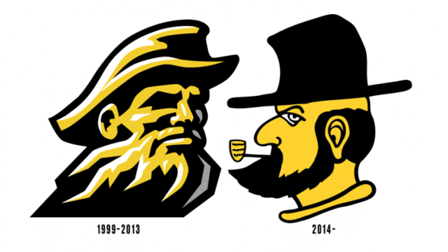
Appalachian State University has replaced its “Yosef Head” logo with a throwback “Victory Yosef” logo that was previously used over three decades ago. Unveiling a new logo can always be tricky — it seems everyone’s a critic, even when the changes are minimal. So given the dramatic changes to Appalachian State’s secondary logo, it’s no surprise there’s been a lot of buzz about the new, or rather, old design.

Appalachian State’s director of athletics says that the throwback logo was initially re-introduced last year and was met with a great response. “The excitement that Victory Yosef has generated among our students, alumni and fans since we introduced it as a throwback logo last fall has been overwhelming,” he said. “Due to its popularity, it only made sense to make Victory Yosef a permanent part of our branding.”

The Internet has not quite agreed though. Fast Company questioned if it was the worst logo of 2013. Deadspin postulated that it might’ve been drawn by a child. While it’s clearly a less sophisticated design than its predecessor, Fast Company also adroitly points out that it seems Appalachian State is re-introducing this throwback logo to be retro for retro’s sake and that it doesn’t serve its purpose as a sports logo – to symbolize the power and pride of a team.

While we appreciate the history of the design, we’re partial to the more modern aesthetic of the old logo. What do you think of new design?

[SportsLogos.net, Fast Company]

Share this article on your social media...

The Author

Picture of Aaron Bernabi

Aaron Bernabi

“It’s just so cool seeing our designs in use. I’ve seen our designs on packing to food trucks and everything in between.” I credit being able to see such successful designs brought to life, this is due to the commitment and dedication of the entire Logoworks team that supports us in each design.

Tags

  • logo criticism, Logo redesign, sports logo

Related Articles

When It’s Time for a Logo Design Update
The Power of Logos: Why You Need a Vector File
Logo Redesign: Transforming Your Outdated Logo into a Modern Design

Leave a Reply Cancel reply

Your email address will not be published. Required fields are marked *

Start your project
  • Logo Design
  • Website Design
  • Stationery Design
  • Business Card Design
  • Social Media Page Design
  • See everything we do
About
  • Company
  • Our Logo
  • Guarantee
  • Jobs
  • Contact Us
Connect
  • Call Us: (919) 244.2535
  • Send an email
  • Facebook
  • Instagram
  • LinkedIn
Resources
  • Terms of Service
  • Privacy Policy
  • Press
  • Partners
  • Blog
  • FAQ

© Logoworks 2025  |   All rights reserved.