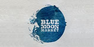
Blue is one of the most complex and contradictory colors, and its meaning can vary depending on the utilized shade. Generally, most blues impart a sense loyalty, trust, confidence, unity, order, and cleanliness. Dark blue tends to be considered authoritative, trustworthy, and dignified. Light blue often gives people a sense of tranquility and harmony. Bright blue is thought of as clean, strong, and reliable. Blue has also been shown to have little effect on taste or smell, so it might also act as an appetite suppressant.
Given its varied meanings, blue is an excellent choice for any logo. However, the shades of blue that you choose for your design can have a huge impact on the perception of your logo. Dark blues work well for corporate logos because they convey confidence. Bright blues can be visually refreshing and energizing, which is great for any fast paced business or organization. Light blues tend to be more relaxing, which makes them more suitable for businesses and organizations that want to be perceived as serene.
Using various hues of blue for your logo can alter the perceptions of your design. For example, a dark blue logo with brighter blue accents can feel both authoritative and fresh, and it would be a wonderful color scheme for any corporate or business logo.
Since blue is such a popular color, however, it is often a great idea to use blue in combination with other colors in order to achieve a more creative effect. Using an analogous color scheme, utilizes the colors that are directly next to blue on a traditional color wheel. These colors are shades of purple and shades of green. Using either of the analogous colors in your color scheme will give your logo a consistent, harmonious feeling.
A complementary color scheme uses the color directly across from blue on the color wheel, shades of orange. Complementary color schemes will make your design more vibrant.
No matter what type of business or organization you have, blue is always a solid choice for your logo design.


