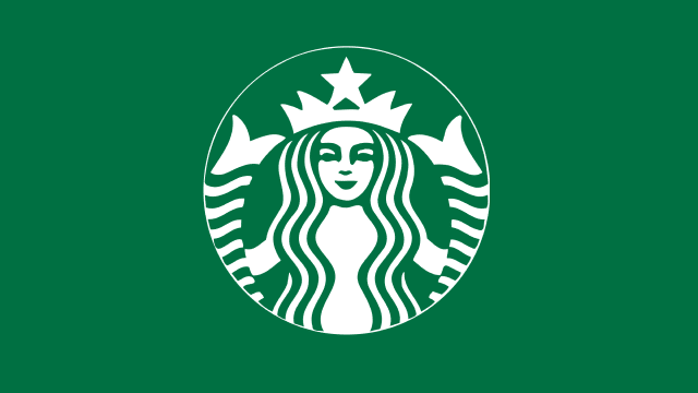
From its small beginnings in 1971, the Starbucks logo design has always been a two-tailed mermaid. These days, we call her by her proper name – the siren, even though the newest logo design doesn’t explicitly show that she has two tails. However, anyone who has ever heard the sing-songy voice of a Starbucks knows that those two stripey designs on the side of her face are in fact her twin tails and that the green woman is most definitely a siren.

Other than the obvious “siren-call” allusion, why else would a coffee company start out with a sea beast as their logo? In short, Terry Heckler, the original sketch artist for the logo, wanted to go with a nautical theme because of the nautical-themed name of the company (“Starbuck” is the first mate in Moby-Dick). After weeks of research, Heckler decided on an old woodcut of a siren as his final inspiration. Thus was born the topless siren of Starbucks, and to this day 42 years later, Heckler cannot stop designing.
Even when the company was sold in 1987 and Heckler’s design could have simply been excused, it wasn’t. The fiendish mermaid was redesigned and she became a bit more modest, but she remained.
There’s more to this fish tale than just the Starbucks logo design, however. The Starbucks logo design elements that make her unique, recognizable, and approachable are worth considering from both a design standpoint and a consumer standpoint. Don’t you wonder why you buy coffee from a fish?
Elements of Design

The Color
Color is one of the most important elements in logo design, partially because no matter what color you choose, you’re making a statement. The Starbucks logo design isn’t an exception. When the original design was changed in 1987, the colors shifted from brown – which stimulates appetite, is associated with the earth, nature, stability, and nature – to a kelly green, which still represents earth and nature, but in a more “eco-friendly” way. Green represents freshness, tranquility, and overall health as well, which ties more in with Starbucks’ representation goals. Steve Murray, the creative director in the Starbucks Global Creative Studio, said this in an article talking about the siren herself:
While we might not notice this by glancing at our coffee cup, the message is still there and grows stronger with every new Starbucks store.
Font – or the Lack Thereof
In 2011, Starbucks changed their mermaid once more to incorporate a few wider lines, a bigger face, slightly modified hair and a removal of font and text entirely. This decision was criticized by both logo designers and fans alike, but six years later she remains textless.
So what does this say about the Starbucks logo design overall? Starbucks thinks their mermaid is so recognizable at this point that they don’t need the distraction of words. Starbucks wants you to focus on the green design, the long flowing hair, the meaning of nature and wholesome goodness. You don’t need to see the words “Starbucks Coffee” to know you’re about to get a superior cup of joe; the mermaid will say everything you need to know with her little Mona Lisa smile.
Shape
The Starbucks logo has, and probably always will be, circular in shape. Again, this may not be something we necessarily notice, but something in us certainly does. Besides just making it easy to stick this on merchandise and rounded cups, the circle is another natural design element. Quickly think of some circles you probably see every day in nature. The moon, perhaps? Your iris? An orange? It is a common, natural shape of unmodified elements of the world. Circles do not have any edges and they do not have a beginning or an end, which adds an element of freedom and infinity.
If we remember that the word “global” is also represented with a circle, then we may have a better understanding of what the shape says about Starbucks: natural, infinite, and here to stay as a globally recognized brand.
So What is There to Learn?
While design elements such as color, shape and font choices DO matter and can represent a grand myriad of important concepts about a company without a single word exchanged, the Starbucks logo sends another clear message: your logo can be whatever you want, and you can still make money doing what you do. You can even build what was small coffee, tea, and spice company with a naked mermaid for a logo into a company that has a 378 million dollar marketing budget. The meaning is there, and so is the thought. Ultimately, however, it isn’t what – or who – that represents your company. It’s all about what you do with it.
While the mission of Starbucks may change over time, the mermaid – with a green circular design – is probably here to stay, and we can look forward to many more smiling cups.


