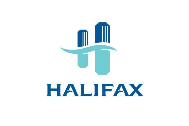
Halifax, Nova Scotia recently released a new logo. The new logo is part of a rebranding effort for the region, which hopes to attract people by updating the area’s identity. Created by the branding firm Resolve, the new identity is based on the slogan “Be Bold”, and the overall identity branding is thoughtful with a lot of structure and support. The actual logo, however, is lackluster. Many feel that is could be for almost anything, a bank, a random business, even another city or municipality.
According to Resolve, “The new Halifax logo is bold in its simplicity. Like our region, the logo is not cluttered, over-embellished or contrived. Its strength is in its simplicity, and its simplicity makes a bold statement. Clean, geometric lines bring quiet strength, energy and balance. It has subtle nods to upward momentum and forward progress. While the colour palette is based on bright colours from our local environment and nature, the base colours are shades of blue, which represent our many lakes, the ocean and the sky.”
The color palette for the other aspects of the rebranding endeavor include shades of green, yellow, purple, and red. As Resolve states, the base colors, the ones used for the logo, are shades of blue. While I cannot argue that the sky and water of the region are not blue, I can say that this color selection creates a very corporate feel. Combined with the straight, hard lines and the modern simplicity, it is no wonder that detractors feel this logo could represent a bank. The logo in and of itself is a good logo. It’s clean, sophisticated, strong, and modern. However, it doesn’t particularly represent Halifax. It doesn’t lend any specific feeling of identity to the region.
Our designers at Logoworks have designed some logos that we think might be better suited for Halifax. What do you think? Do like Halifax’s old logo, or are you a fan of the new one? Would you prefer one of our designs? Which one do you think best represents the Municipality of Halifax?
In this design, the “I” is still used as a beacon, with the water waves cut off from the text on the bottom. This is a minimalist approach, with a clean, safe, sharp feel that still incorporates elements of the former logo.
This logo design is intended to represent the diversity of the city. The presentation is in a crisp, clean, modern arrangement, asserting the modernity of the region.
This design offers a unique “H” logo with an illustration of a water droplet and ripple, which creates a negative space on the blue box, forming the “H”. It is paired with a solid and sophisticated modern font below the logo.
This logo design links the city’s growth & strength with its water elements through color & design

