Founded in 2003 by Nicholas Woodman, GoPro is an action camera company, based in San Mateo, CA. GoPro cameras have gained much popularity in the last decade, making it possible for average adventurous folks to make their own awesome action videos. In February of 2014, GoPro announced its intention to go public, after filing confidential initial public offering documents with the Securities and Exchange Commission to sell its common stock. The news of this IPO filing occurred just three short days after GoPro announced the hiring of Jack Lazar as its new chief financial officer. Lazar, a former Qualcomm executive, made this statement regarding GoPro. “As both a premier consumer products company and an enabler of compelling media content, GoPro is a high-growth company with a strong track record for innovation and for defining new markets.” According to Founder and CEO, Nicholas Woodman, Lazar’s “experience and leadership will be extremely valuable as GoPro explores new markets and opportunities in both consumer products and media.” Now GoPro has officially gone public! Given that Go Pro is headed in an exciting new public direction, perhaps it is time for the company to reconsider its logo design.
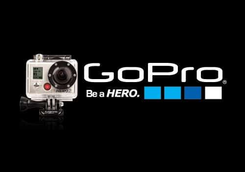
In truth, there is nothing innately wrong with GoPro’s logo. It appears rugged, much like its product. However, this logo could belong to any company anywhere. For a business as innovative and inspiring as GoPro, this logo is lacking in creativity. It simply doesn’t match the brand identity that GoPro has created, and it certainly doesn’t fit with the company’s plan to move forward. “Be a Hero” is an excellent statement for the action camera company, but the font is lackluster. I personally really like the color blue, but I don’t particularly think that three blue squares with a white one tacked on at the end says much about the personality or ambitions of this company. Thus, as GoPro makes its public debut, perhaps the company ought to consider redesigning its logo too. A new logo could reflect the new directions that GoPro intends to take its currently one camera company.
Our awesome designers here at Logoworks have few suggestions for GoPro’s new logo.
This logo represents movement, motion, and action, something that the current logo is lacking. Furthermore, it includes a subtle nod to the camera since this is, after all, a camera company.
This logo is a graphic representation of capturing the world at high speed. The font is strong, clean, and will look great on anything.

So, what do you think of GoPro’s logo? Is it time for a change now that the company is moving a new directions? Which one of our logos is your favorite?


