Skip to content
  • Packages & Pricing
  • Gallery
    • Logos
    • Business Cards
    • Stationery Designs
    • Websites Gallery
    • Social Media Designs
    • Themed Logos Designs
  • About us
    • What we do
    • Learn about our logo
    • See what the press says
    • Logoworks Jobs
    • Contact Us
  • Blog
  • FAQ
  • Login

919 244 2535

Five Technology Company Logos Redesigned with Vintage Elements

8 years ago
  • Branding, Design, Design of the week, Logos

Sometimes, the world just needs to be a little bit…older. Rather, vintage. Like wine.

So we decided to bring a couple of our designers in on this and have them do some vintage tech company designs. They came out great, so we’re sharing for your amusement and your daily taste of old-school.

Our designers rocked these (because we don’t do any spec work, and actually PAY our designers when they make a design) so we thought they should all be shared. Enjoy!
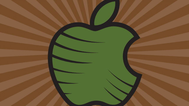
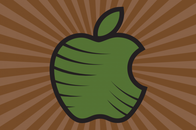
Apple

We like the futuristic apple that is Apple’s logo just as much as anyone, but what if that apple actually LOOKED like an apple? This design pulls all of those good nature-y vibes out of the toolbox. Maybe this wouldn’t be a terrible design for them – they are trying to change the world and are going more “green”, afterall!
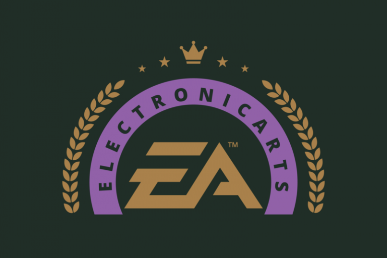
EA Games

Electronic Arts – we think you deserve to be royalty after surviving in an incredibly competitive field for so long, so we pulled out the royal colors – and a crown – for you.
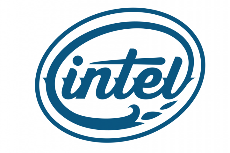
Intel

It was just time for a little update, Intel. if Marvel can do some fun bubble lettering, you guys can have some vintage features (that are actually quite modern) and a fun, custom font. Keep your blue, though, since we want to keep trusting you, and that’s what blue represents.

Nintendo

We couldn’t make your logo anymore retro, Nintendo.

So we just made it cooler.

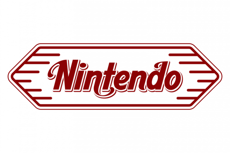
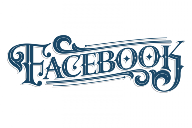
And last but not least, Facebook

Facebook, we know you’ve been leading the way on a modern, easy-to-glance-at-and-recognize logo. In fact, your logo hasn’t changed very much in the past decade.

But if you ever need a logo for your new penny arcade where you sell cream sodas and everyone wears a fun fancy mustache, you know who to go to.

Share this article on your social media...

The Author

Picture of Aaron Bernabi

Aaron Bernabi

“It’s just so cool seeing our designs in use. I’ve seen our designs on packing to food trucks and everything in between.” I credit being able to see such successful designs brought to life, this is due to the commitment and dedication of the entire Logoworks team that supports us in each design.

Tags

  • Apple, brand identity, branding, cool logos, designers, EA Games, Facebook, fun logos, Intel, intel logo, Logo redesign, logos, nintendo logo, redesign, retro logos, technology

Related Articles

When It’s Time for a Logo Design Update
Business Card Design Checklist
The Power of Logos: Why You Need a Vector File

Leave a Reply Cancel reply

Your email address will not be published. Required fields are marked *

Start your project
  • Logo Design
  • Website Design
  • Stationery Design
  • Business Card Design
  • Social Media Page Design
  • See everything we do
About
  • Company
  • Our Logo
  • Guarantee
  • Jobs
  • Contact Us
Connect
  • Call Us: (919) 244.2535
  • Send an email
  • Facebook
  • Instagram
  • LinkedIn
Resources
  • Terms of Service
  • Privacy Policy
  • Press
  • Partners
  • Blog
  • FAQ

© Logoworks 2025  |   All rights reserved.