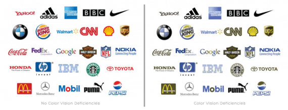
Color-blindness doesn’t properly describe the experience of people who don’t see color like the majority of the adult human population. These people are actually experiencing color deficiencies, so that will be the term that I use from now on. The most common form of color deficiency manifests as the inability to differentiate between green and red. There are two common types of this particular deficiency. Protanopia is the most common of the two, and it results from an insensitivity to red light, which causes confusion between greens, reds, and yellows.
Deuteranopia is caused by an insensitivity to green light, which results in confusion between greens, reds, and yellows.
A less common type of color deficiency is when an individual is only able to see shades of grey, or monochromatically.
Whether designing a new corporate logo or trying to create a logo for your fledgling business, you want to maximize the potential of your logo to reach as many people as possible, so you might want to consider the effects of your color arrangement on individuals with color deficiencies. Now that we have a basic understanding of color deficiency, we can account for the unique challenges that this can present for designers. Color codes and color contrasts can be tricky because they are difficult, if not impossible, for individuals with color deficiencies to see. However, color may be very sensitive and perceived differently in different mediums. For example, a person with red-green deficiencies may have difficulty distinguishing between colors on paper as opposed to on a media screen. Furthermore, some people see otherwise problematic colors better on artificial mediums, such as plastic, than on natural ones, such as wood. Additionally, a larger mass of color can also be easier to see. For example, a thin line of color might simply appear black, whereas a thick line might appear to have color.
Because protanopia is the most common form of color deficiency, many people have a “green is good, red is bad” mentality when it comes to designing logos. However, yellow-blue and red-blue combinations are generally alright for people with a red-green deficiency. This continues to present difficulties when designing for people with monochromatic deficiencies, but it is definitely worth consideration when you create your own logo.


