Last night I had a dream that these guys were driving around my neighborhood dubiously “fixing” the houses. The signage on their truck said that they worked for some sort of construction company, but it looked completely unprofessional. As a result, my dreaming self thought these guys looked pretty sketchy. Maybe they weren’t really construction workers at all. Maybe they were actually criminals casing the neighborhood. Yeah, I know I have strange dreams, often about mundane things. However, my dream raises a good point. I judged the potential quality of these guys’ work based on the sign on their truck. Surely, I’m not the only person who does this. Most of us do this sort of thing al the time. A company’s logo influences our perception of that company’s products or services. In the case of my dream, I deemed the services of this construction company to be unreliable because the sign on the truck lacked quality.
So, what makes a construction logo good? Well, there are several aspects of the design process to consider when creating a logo for a construction company. First, it ought to be clearly related to its particular industry. A viewer should be able to look at the design and know what type of company the logo represents. Many construction companies choose to use images of tools, house shapes, and squares to indicate the type of business.
A good construction logo should also make people feel that the business is reliable and established. Thus, shape isn’t used only to indicate the type of business. Shapes can also be utilized in order to evoke particular feelings viewers. Squares imply durability and reliability. Triangles symbolize strength, prominence, and prestige.
Font is also an incredibly important aspect of a good construction logo design. The choice of font can drastically alter how the business is perceived. If you are having a custom logo designed by a professional graphic designer, then this is an especially critical decision to discuss with your graphic designer. A heavy block lettered font can feel stronger, and the squared thick-lined letters elicit a sense of honesty. Scrolling fonts, with their rounded lettering, are softer and more elegant, inspiring a friendlier feeling.
Finally, color is definitely important for a good construction logo. Bright colors, especially red, yellow, and orange and blue, remind viewers of the signs and equipment of construction sites in addition to drawing attention to the design. However, more subtle colors can work well too if the logo design is strong enough.
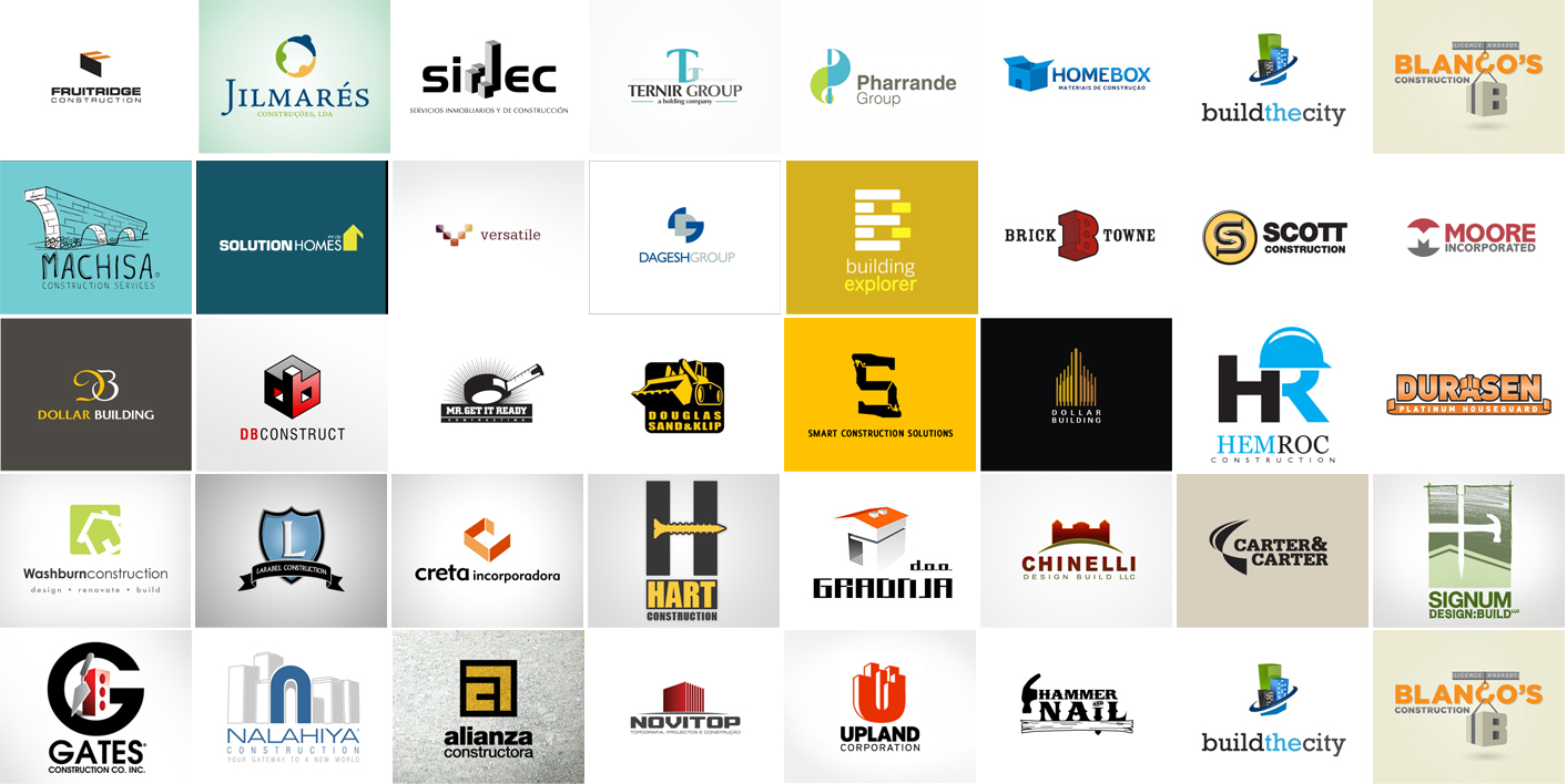
Here are some more construction logo designs to help inspire you.

