In what has become something of a tradition here on the Logoworks blog, let’s examine two sports team logos—this time from the NHL.
We begin with the Detroit Red Wings, one of the “Original Six” NHL teams—those that made up the league for the 25 seasons between  1942 and the 1967 NHL Expansion. In 1932, first known as the Cougars and then the Falcons, the team was bought by Canadian-American grain and cattle magnate James E. Norris. Norris had once played hockey himself as a child for a team called the Winged Wheelers in the Montreal Amateur Athletic Association. He felt that a spin on the Winged Wheelers logo would work perfectly for a hockey team based in the Motor City. So on October 5, 1932, the team was renamed the Red Wings and introduced a new logo consisting of a red and white automobile tire with wings. Nostalgia along with a fondness for his childhood led Norris to the creation of this sports logo.
And the new identity in name and image coincided with a reversal of fortunes for the team; they made the playoffs in their first season and won their first Stanley Cup in 1936. The Red Wings’ logo has remained essentially the same throughout the team’s history. Be on the lookout for a throwback 1930s iteration of the winged wheel on the team’s uniforms in the 2014 Winter Classic game, which will be played outdoors at Michigan Stadium between the Red Wings and the Toronto Maple Leafs on New Years Day.
Now, we can’t discuss hockey without bringing Canada into the equation, so next let’s take a look at the Winnipeg Jets’ logo. Winnipeg 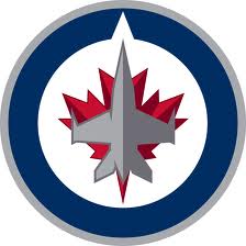 is home to a major Royal Canadian Air Force (RCAF) base, and the Jets’ logo is inspired by the RCAF insignia, consisting of a gray CF-18 Hornet fighter jet laid over a red maple leaf surrounded by a navy blue and gray circle, known in military parlance as a roundel. As with the case of the Red Wings, here we have a logo that firmly connects itself to the community and identity of its hometown. In fact, when the franchise relocated from Atlanta (where they were known as the Thrashers) in early 2011, they unveiled their new jerseys at 17 Wing, a military base near Winnipeg’s airport. The team signed a nine-page contract with Canada’s Defense Department stipulating terms of the logo’s use. According to a Canadian Press article, this means the Jets can only use the logo “in such manner as to protect and preserve the reputation and integrity of Her Majesty the Queen in Right of Canada, as represented by the Minister of National Defence, and the Canadian Forces.”
So there you have it, a perennial logo out of Detroit and a brand-new one out of Winnipeg—both of which proudly echo the prominent industries within their respective cities. Now, sit back and enjoy the season!