With the onset of Halloween, ghosts are definitely on my mind. So much that I’ve actually taken to rewatching the Ghostbusters movies, popcorn in hand, with my family. Naturally, this includes Ghostbusters 2, and a lot of staring at the Ghostbusters and Ghostbusters 2 logo placements (hey, I work for a design company. What do you expect?)
Ghostbusters makes movies fun. Not only is it hilarious, the special effects are actually pretty good if you ignore small “it’s a product of its time” glitches. And how many of you aren’t humming that theme song right now? Only those of you who are monsters, I assume. And the rest of us know who we gonna call to educate you.
Jokes aside, it really is a great movie. It’s fun and interesting and it makes light of one of the scariest things known to man – ghosts. You laugh, but they’re terrifying if you stop and think about them for a second. And then in come the Ghostbusters. They bust that ghosty and squash it and destroy it and all is well in the neighborhood. It makes something terrifying something that any old person can face. Even the logo kind of makes them look less dangerous. Oh no, he seems to be saying! OH NO! The Ghostbusters are going to bust me!
Quite glorious.
The Diagesis of the Ghostbusters Logo That’s Missing in the Ghostbusters 2 Logo
In addition, the logo from the original movie is something that film nerds call “diagetic,” or in layman’s terms, a logo that actually refers to something in the movie (Jurassic Park is an excellent example, as the logo is representative of the dinosaur park). This is super awesome because not only is the logo selling us the movie, it’s doing double duty by having the characters sell us on it, too. And boy, do those characters have to sell it because their world is full of incredibly demonic spirits and dangerous ghosts that look just about as Casperish as an ox. We learn something about the characters here. We learn how they see ghosts and how they want other people to see them. Clever and fun.
It’s a brillliant, brilliant logo. So, why is it, then, that the Ghostbusters II logo is so bad?
It Literally Makes Fun of Itself
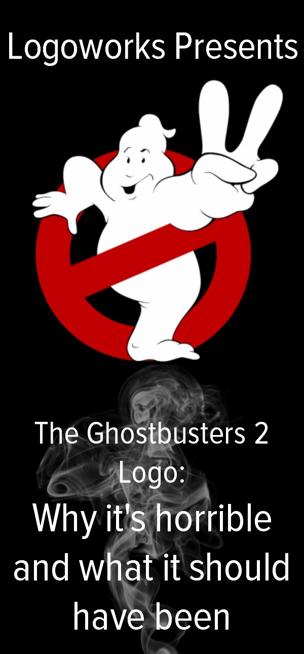
I cannot, for the life of me, figure out why the Ghostbusters 2 logo makes fun of the business it represents. Sure, this might make sense to us on the outside – we see a ghost who looks like a jerk holding up a two, and it reminds us of the original and still has a difference that’s big enough to make us realize that it’s a different movie. However, it makes little sense inside the movie. There’s not really a point in making fun of a logo that represents a pretty serious (and awesome) business inside of your movie – they kicked butt in the first movie, why would they make fun of themselves? This is bad design, period. It isn’t thoughtful, and if design is one thing, it is that.
He’s Cheerful
Why isn’t this ghost terrified of being busted? He should be, those vacuums are downright frightening and no fun for any ghost I’ve ever seen involved. It doesn’t make a lot of sense for the ghost to be happy about his escape. If a client came up to one of our designers and said, “okay so I made a wildly successful movie, and I want to randomly switch an element from black to white, do it!” we would probably do what he told us to do, but not without lots of questions and consideration of consistency.
We Don’t Learn Anything New
Not all logos are meant to teach us new things, this much is true. But if you go as far as to thoughtfully construct an image that exists well inside and outside of a movie world, then the second logo for the second movie should do the same thing and entertain the viewers at the same time. Just because it’s the second Ghostbusters does not mean that the Ghostbusters 2 logo deserves less thought or meaning. Not only is this inconsistent, it’s sloppy and unrefined as far as representation goes – which is a huge, huge no-no in the world of design. The folks that designed this logo in-universe should be ashamed.
Honestly, they could have just left it the way it was and added a two in the title, but since it’s already been redesigned, we decided to run with it with our design.
Our Take
We did this design because:
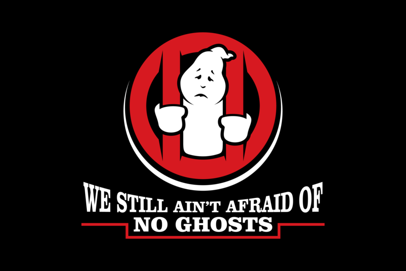
- The ghost is still sad, but he’s still our favorite frosty-headed fellow. If nothing, he’s actually sadder than he is in the original logo.
- The design is reminiscent of the original design, and the “2” in the Ghostbusters 2 logo has been cleverly integrated into the logo, but it isn’t all in your face.
- If they wanted to update the design of the company, this would be a comical but accurate update: sadder ghost, more bars, and they just ain’t afraid of no ghosts…still.
Our design is much more clear and introduces some of the original cleverness back into the design.
By the way – boo!


