There has been lots of news hovering around the logo blogosphere.
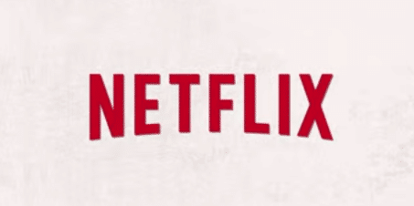
Netflix has a new logo!
At least I think they do…
… they did…
Well, wait a second, where’d it go?
Netflix does in fact have a new logo, or so we think. It has only been featured on a few promotional videos for select shows, all of which are part of Netflix Original Series; Orange is the New Black, Derek, and The Killing.
The logo was first noticed by a Reddit user while watching a promo video, but does not appear anywhere on the company’s actual website. The new logo still features the spelled out “NETFLIX” but ditched the fireman-red background for a subdued white with the brand written in red instead. The company name features a slightly more curved bottom which some are speculating is to mimic the famous Hollywood sign at the entrance of the city.
While most people liked the old logo for its throwback to old theater with the large white letters and black shadow, the new logo has been met with positive remarks for the most part. Many have noted that the icon will be better for mobile devices (the removal of the red background creates a less jarring app) while others say the new logo provides a cleaner and refreshed look.
Some feel why change something that’s working. With Netflix being used in almost every household, why change the ubiquitous sign and force consumers to re-recognize who you are.
But the main stir of the logo is not the icon itself, but why the secrecy with the logo launch?
News sites including Business Insider, CNN and even the New York Times bit blog have questioned why Netflix had no formal announcement of the new logo and why it has only been launched on a few videos.
Though no one is sure whether or not Netflix will fully launch or even use the new logo, both logos, past and present, do reflect the company’s branding goals – an eye catching color (red) with an homage to the classic Hollywood movie theater design.


