Spring is here. My backyard is in a sorry state. It’s time to clean it up and plant some cool stuff. I totally have a black thumb when it comes to growing things; however, my new yard really lends itself to having a garden. I would love to be able to grow some of my own vegetables, fruits, and herbs. I know I am not alone in this. As more and more people are realizing the need to take better care of our planet, to take better care of each other, and to take better care of ourselves, sustainability has become an indelible issue in the current conversation regarding global change. As such, more and more farmers are beginning to incorporate sustainable farming practices. Furthermore, more people are taking an interest in sustainable farming. Thus, I have five cool logos from sustainable farms. All of these logo meet the criteria for a good logo; they are simple, distinctive, versatile, relevant to their industry, and timeless.
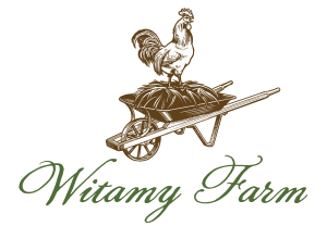
I love the juxtaposition between the elegant typography and the ruggedness of the rooster on the hay-filled wheelbarrow.
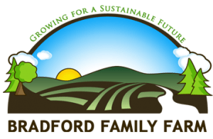
I love how the use of curved lines in this logo creates a sense of friendliness.
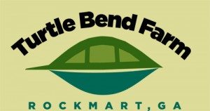
I love the simplicity of this logo design. With just two colors, it imparts both the idea of a leaf and the idea of a turtle on the water.
Again, I love the simplicity of this logo. It’s excellent utilization of negative space imparts a sense of growing a better world, while still acknowledging its mountainous location.
This logo incorporates some great techniques. The colors are great, very earthy; however, this logo would still look good in black and white. The use of curvature lends a friendly vibe, and including the arrows to imply the recycling process is a really cool touch.

