Part of The Weather Company, and based in San Francisco, California, Weather Underground was founded in 1995 as the first online weather service.. Through mobile apps and the website wunderground.com, the company supplies weather data to many media companies and millions of users worldwide. Recently, this particular branch of The Weather Channel has undergone a bit of rebranding. They’ve revamped their logo, and they have a lot to say about it.
First, here’s the old logo. I can see why it needed some updating. It rather reminds me of something I might have once seen on one of my My Little Ponies in the 1980s. Her name would have been Stormy Rainbow, or something like that.
Before I tell you what I think of this rebranding effort, let’s review what Weather Underground has to say.
Regarding the new logo: “We’ve merged the past, present, and future by creating a fresh look that scales across today’s devices, adapts to tomorrow’s technology, and maintains our classic rainbow spectrum. The raindrop’s relationship to the U represents a rain gauge, a subtle nod to both our passion for data collection, and our incredible PWS community.”
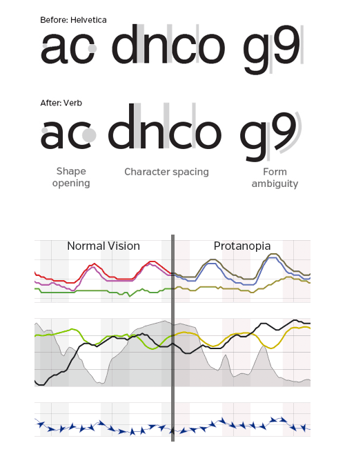
Regarding the new font: “We’ve updated our type to a more legible typeface. By selecting a typeface with more character variation, words become easier to discern, which means you get your data even faster.
Regarding the new color palette: “Not only does it better convey information consistently across our products, but it also works better for the color blind.”


