I’ve spent quite a bit of time in the last few weeks scrolling through pages and pages of creative, interesting, and some not so interesting logos and graphic designs. While I’ve seen plenty of modern designs, a lot of what I’ve come across has a vintage or a retro feel to it. I started to wonder about the benefits of vintage and retro logos and why people love them so much. Here are a few things that I noticed.
The Feeling of Vintage and Retro Logos
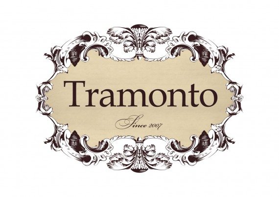
Vintage and retro logo designs evoke feelings of nostalgia. In a world that has become so high-tech and fast paced, such logos seem to embody an earlier time when life was a bit slower. Vintage logos can elicit a sense of history, of stability, of reliability, and of value. Even if your business or organization is new, using a vintage design for your logo can give people the feeling that it has been around for a while, that it’s a company they can trust.
Color Schemes For Vintage and Retro Logos
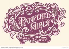
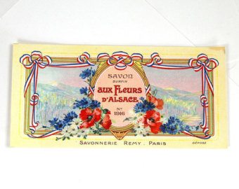
Vintage color schemes tend to use softer, more muted, neutral colors, such as pastels and tans. They tend to focus more on the curvature and organic movement of lines, which are characteristics of early twentieth century design motifs fashioned in the popular Art Nouveau style of the period.
Retro color arrangements tend to be sharper and brighter. They are more consistent with the design motif of the 1950s and 1960s, a period of design which was heavily influenced by the Art Deco movement. Thus, retro logos often have a symmetrical and linear design with bolder edges, more characteristic of this mid-century style. You can still create incredibly awesome and unique designs while maintaining consistency with vintage or retro themes and colors; however, giving your vintage or retro design a more modern color scheme can give your logo a more updated feeling, infusing it with a little pizazz that will really set it apart from other designs.
Fonts For Vintage and Retro Logos
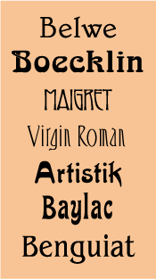
Vintage, or Art Nouveau, fonts are generally extremely stylized. These elegant and highly decorative designs may include features such as diagonal and triangular character shapes, embellished stroke endings, angled crossbars, very high and low “waistlines”, and top-weighted or bottom-weighted stresses. Some of the current Art Nouveau fonts that are available are authentic reproductions of typefaces from that period, while others are original creations that have been inspired by the Art Nouveau style.
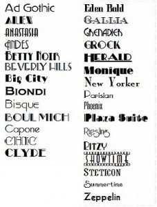
Retro, or Art Deco, fonts tend to be more streamlined and geometric. These fonts are characterized by straight lines and sharp angles.
Faced with the complexity and increasing anonymity of our modern world, many people long for something simple, for a time when people interacted more and businesses actually knew their customers. Vintage and retro logo designs are reminiscent of days when life was different, when business was more personal. Having a vintage logo can say a lot about your business and its values. Furthermore, a well done vintage or retro logo can be timeless, making it just as relevant years from now as it is today.

