Anyone who is watching the 2014 Winter Olympic Games will notice that this year the Sochi logo is remarkably different than Olympic logos in past years. This futuristic logo is clearly lacking the artwork that most of the previous Olympic logos included. Dating back to 1896, nearly all of the Olympic logos contained some artistic design elements in order to help represent the country in which the games were taking place. The Sochi logo, however, has taken an completely different approach.
The Sochi logo is comprised simply of blue lowercase block lettering, which contain the web address for the Olympic games, and the iconic Olympic rings. It was designed by Interbrand Agency, a Moscow based team comprised of eight members from around the world. After many revisions, this more futuristic design was ultimately decided upon by the Organizing Committee. When the Sochi 2014 logo was unveiled, the Organizing Committee described it as being representative of “the first digital brand in the history of the Olympic Movement,” and that this corresponded “to the strategic vision of the Organizing Committee to host the most innovative Games in history, which reflect the character of the new Russia and deliver positive, sustainable change.” Alright. How does it compare to other Olympic designs though?
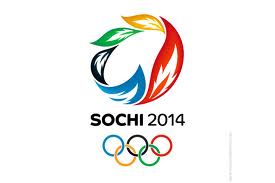
After it was released, the Sochi logo received some significant criticism for its simplicity, and many people felt that it was difficult to read. However, some feel that the block lettering is reminiscent of Russia’s famous wartime posters, evoking the strength that is characteristic of that era in Russian design. Some of those who opposed the Sochi logo felt that an alternate logo from Transformer Studio, who was one of the finalists for the Olympic logo design, would have been more suitable.
The design from Transformer studio is certainly more traditional. It has the artwork that is characteristic of previous Olympic logos. In fact, it looks a lot like any other Olympic logo. Does this scream Winter Olympic Games in Russia though? Perhaps the Sochi 2014 logo is taking the Olympic logo designs in a new, more modern direction.

