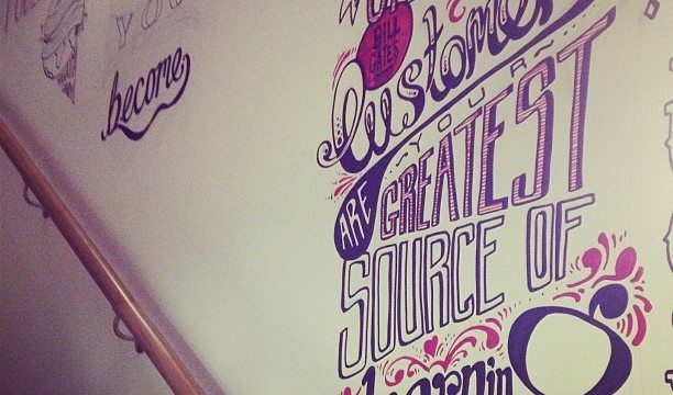
While you don’t need an art school background to understand and appreciate good graphic design, becoming familiar with some basic design principles can pay big dividends if you’re thinking about hiring a graphic designer to work with your business or brand.
Do Your Homework
Start by spending some time looking at your competition’s logos, websites and business cards, and take notes about your reactions. You’ll quickly find that you have opinions about what you like and don’t like. Even reactions that seem vague to you (“I hate the color orange” or “I like XYZ’s logo”) can help a savvy graphic designer create a product you’ll love.
Space Out
When it comes to graphic design, what’s left out is just as important as what’s put in. Good designs use white space — areas intentionally left blank — to balance out text and images. Your eyes need this uncluttered space to help you figure out what’s important and to guide you as you read a web page or brochure. Using white space effectively makes a design more attractive to the reader and easier to use.
Decide on Content
Just as you can’t write an article if you don’t know what you’re trying to say, you can’t select the perfect design if you haven’t thought about what you’re trying to communicate. What adjectives describe your business? What message should prospective clients or customers take from your logo or website? Jot down a few important ideas that you want to get across, and make a list of vital information that must be included in a design (your website URL and email address, for example, must appear on a business card, whereas a photograph of your office need not).
Simplify
It’s human nature to overdo things: too many words, too many images and too many colors. An experienced graphic designer can help you pare down your design, letting a clear and unified message shine through.
Focus on Fonts
The style of typeface used can make or break a design. Subtle differences, like a serif (the “feet” at the bottom of some letters) or the thickness of the strokes can play a surprisingly big role in a reader’s reaction to a font. Avoid cutesy styles (like Curlz), overused fonts (like Papyrus), and above all else, stay away from Comic Sans.
Contemplate Color
Color choice is more than just an aesthetic decision; colors often have symbolic meanings that can affect how a design is perceived. Warm colors, like red and yellow, are energetic and attract attention, while cool blues and lavenders are soothing. Specific colors often carry symbolism; green, for example, is associated with nature — a good choice for a landscaper or nursery. Pink is considered by many to be a feminine color, perhaps not the best choice if your customers are predominantly men. Give some thought to the colors you gravitate toward, and consider how they affect the overall look and meaning of a design.
Stay On Message
The best design is one that represents your brand or business most effectively. Blindly following fads or copying the look of other logos or websites won’t accomplish that. When evaluating a design, think about how each individual component –font, color, layout, and logo, to name a few– represents your business and what message each component sends. By keeping an eye on your goals, you’ll end up with a design that looks good and does the job for years to come.


