A few weeks ago, we took a closer look at Milton Glaser’s iconic “I Love New York” logo. While perhaps the most famous and far-reaching, New York is not alone in having a state logo. In fact, visit the tourism department website of any of the 50 states and you’ll find a logo—and often a slogan to match. But it’s Colorado that has recently been making waves with its comprehensive new state brand campaign, unveiled in late August of this year.
In 2012, Colorado Governor John Hickenlooper tapped Aaron Kennedy to be the state’s chief marketing officer and to lead the rebranding effort, as part of the overall “Colorado Blueprint” economic development plan. Governor Hickenlooper saw a promising track record in Kennedy, who founded the successful fast-casual 300-location Noodles & Company restaurant chain and also served as marketing executive for Pepsi during its rebranding in the early 1990s. Under the “Making Colorado” initiative, Kennedy oversaw a collaborative group of business leaders, graphic designers, and marketing professionals, and also researched effective U.S. state and city brands, collecting extensive feedback from residents.
In the Denver Post, Governor Hickenlooper explained the core mission of the campaign: “To me, it’s all about jobs,” he said. “It is about attracting businesses to the state and supporting the businesses that are here. We’ve always marketed ourselves as a resort and a place where people come to relax and get away from it all. But at the same time, we’ve been building a very diverse economy.”
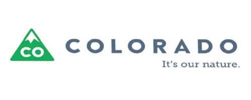
The result: A green-and-white snow-capped triangle with the letters “CO” within, and “Colorado” written beneath with an accompanying, “It’s our nature” slogan. A custom typeface, Neue Colorado, was developed for the logo, too. The official Brand Colorado website makes the case for the logo: “Like Colorado itself, our new logo combines the familiar with the unexpected. It draws clear influence from our world-famous mountains and beloved license plate. But its shape, an upward facing arrow with rounded corners, also serves as a symbol of Colorado’s momentum and a reminder of its friendly and approachable attitude.”
The logo is very much intended to be a tool to sell the state. Through the Brand Colorado site, Colorado companies can apply to include the CO triangle on their products and marketing materials royalty-free. And the logo is being incorporated into a great range of state government-related materials, from signs and letterheads, to vehicle emblems, business cards, and beyond. Sure, with many residents deeply attached to the state flag, Colorado’s logo has experienced its fair share of criticism. Nevertheless, we can’t help but get excited about this modern 21st-century, innovative new direction in state branding.


