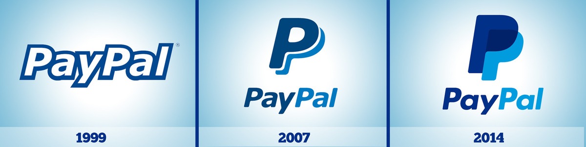
PayPal’s new logo is no huge change. The colors are the same, the font is the same and the design is more or less the same too. But, the idea behind it shows it to be an image of the future.
The new design, which features two filled in Ps stacked on top of each other, is entirely geared for mobile websites. As a payment method currently primarily used on websites, PayPal needed a logo that was recognizable and easy to spot.
![]()
By coloring in the Ps instead of just leaving them as “bubble letters”, the Ps have a richer texture and give off a bolder stance. By ridding them of the white background, the letters can easily stand alone in the corner of a website and still be noticeable, or against a white square background as a mobile app.
PayPal’s biggest jump was changing its original logo back from 2007, which spelled out the company’s name, to the shortened “P” for PayPal. The original logo explained who they are and allowed for name recognition. But as the company continued to grow and gain popularity, the recognition was attained and in 2012 PayPal shortened its logo to the simple P, showing they were an easy frictionless method of payment.
Now as an established name, PayPal is continuing to work to become more convenient. As PayPal continues to expand and gain merchants, PayPal is now being accepted in-store at various retail shops; they’re hoping their new logo will stand firm for a while for mobile devices, websites and storefronts.