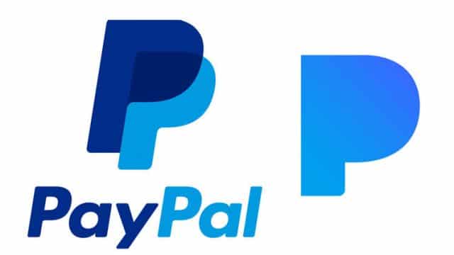
Listen, we all make mistakes…and I’m not even sure that Pandora made a mistake. They are in an entirely different niche and while their logos could be easily confused, PayPal does not offer music and Pandora does not offer payment services.
However, the logos ARE remarkably alike, and it makes sense that PayPal feels a little insulted. In addition, Pandora is fun – they stream customized music channels, for Pete’s Sake – and they deserve more than just a plain ol’ blue P for their logo.
So we decided we’d introduce a few more logos and see if Pandora might be interested in changing it up before it costs them a bunch of money in court.
While this is a pretty classic style and resembles their current logo, it’s still pretty awesomely different and looks nothing like the PayPal logo.
Here’s an option that is kind of fun and quirky and while it still has a P as the center idea, it’s been stylized to include some charming whimsical headphones.
Here’s a good use of negative space and a stylized text. A bold, rich text accompanies a P with obvious and charming headphones – what could be more cute? I am not sure what could possibly be more cute, honestly. While it’s fun and adorable, it’s still professional – and really gets the idea of music across, which doesn’t really come across with the word “Pandora”.
What do you think?
Three logos, three entirely different images – which would you choose if you were Pandora?

