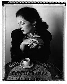
You’ve seen her work in a range of logos and packaging designs, but Louise Fili’s famous calligraphy is more than just lettering. Based in New York, Fili is the founder of Louise Fili Ltd, and she certainly knows a thing or two about brand building and the critical importance of design.
Early Influences
Born on April 12, 1951, in Orange, New Jersey, Louise Fili displayed early graphic art skills by carving letterforms into her bedroom wall as a youngster. In high school, she bought an Osmiroid pen, thus paving the way for her self-taught calligraphy talents to emerge. While studying graphic design in college, she landed her first job in New York in 1973 as a book artist for Knopf. In 1976, Fili began working as the senior designer for celebrated graphic artist Herb Lubalin, and later she lent her talents to Pantheon Books as an art director, where she masterfully designed roughly 2,000 book jackets. Not wanting to use existing typefaces for the covers, Fili designed her own – a practice that would lead to her signature style. She found much of her inspiration from Harris Lewine, one of her clients whose interest in historical graphic design influenced her to seek ideas from frequent trips to European flea markets.
Designing Woman
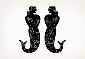
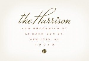
Fili left Pantheon Books and set out on her own in 1989, launching a business out of her home studio. She ensured that her focus never strayed from her main interests, “food, type, and all things Italian.” Her game plan worked, as she proceeded to create exquisite brand-building designs for numerous New York restaurants, including The Mermaid Inn, Artisanal, Picholine and the Harrison. Her packaging designs soon transformed famous brands Sarabeth’s, Bella Cucina and Tate’s, and she created special designs for chef Jean-Georges’ culinary line.
Noted Works of Art
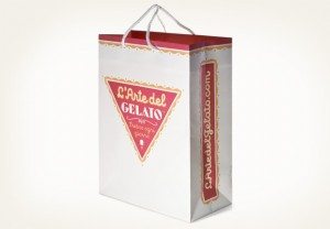
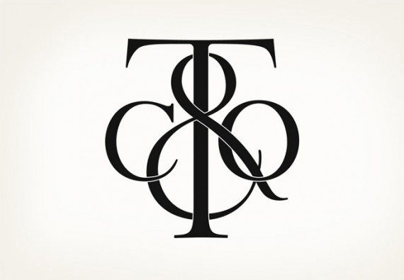
In 2009, Fili revamped Good Housekeeping’s Seal of Approval in honor of its 100th anniversary. Her typography can be seen on Late July’s cracker packaging, the Irving Farm brand’s coffee labels and L’Arte del Gelato’s packages of Sicilian sweetness. She even created Tiffany and Co.’s exquisite monogram.
Fili’s husband, design historian Steven Heller, adored her artwork prior to their initial meeting, prompting him to write her a fan letter. “I noticed Louise’s work long before we met. In fact, it was the work that prompted me to write her and later meet her. What I saw in the work was a distinctive flair. It had bits of the past, but entirely reinterpreted.… More importantly, in a sea of book jackets and covers… her designs stood out for their precision, humanity and aesthetic joy.”
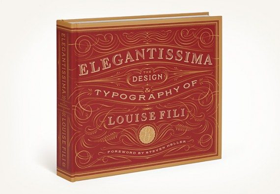
Louise Fili’s hand-drawn typography truly sets her apart in a computer and web design marketplace. Her fonts are distinctly classy, historically inspired and beautifully elegant. Fili teaches at the School of Visual Arts, participating in its summertime Masters Workshops in Rome and Venice. She was inducted into the Art Directors Club Hall of Fame in 2004 and is a three-time nominee for the James Beard Award. Her work is featured in the permanent collections of the Library of Congress, the Bibliotheque Nationale and the Cooper-Hewitt Museum. In 2012, a collection of her inspiring designs was published as the book “Elegantissima: The Design & Typography of Louise Fili.”

