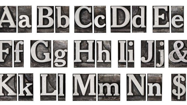
“Font” is often confused with the word “text.” Font is like handwriting for typed characters, while text IS the typed characters. The creation and use of fonts is fascinating, and I believe it can make or break a logo more than any other specific element. So what does your logo font say about your company?
To Serif, or not to Serif?
First, there are different styles of fonts to consider. Should it look like handwriting? Should there only be upper case letters? One of the things to decide is whether or not to use a font with serifs. Serifs are the tags or tails on the ends of letters. If a font is Sans-Serif that just means it doesn’t have the little tails on the letters. To demonstrate with a visual example, see the way Logoworks is written out below:

Now compare those above to these below:

Space cowboys; Kerning & Tracking
After a style of font is decided upon (whether it be script/ block, thin/thick, all-capital letters, etc), a designer addresses the natural spacing in between the letters. The spacing between two letters is called Kerning, and it should balance well enough that the words are clearly readable. Each font is created with an automatic kerning. The characters A and V demonstrate kerning quite well:


Tracking is the overall spacing between all the letters on a line. Tracking isn’t specific to each font, and can be adjusted by the graphic designer to make the specific logo text balanced.
Skilled graphic designers will adjust the kerning and tracking on your logo so the lettering is balanced and communicates your brand well.
The Sum of All the Parts
One of the key attributes of a great logo is having your name (your brand) be memorable. In order for the human memory to retain it, first the words must be recognizable. If a font is confusing, if there are too many fonts used or if it’s too small, the name will get lost. Whether the font in your logo is script or block, thick or thin, on a straight line or on a curve, don’t let your brand fall victim to a font faux pas. Instead, let the design experts optimize your brand by making sure your font works.


