One can learn a lot about design by simply looking at other people’s work. Today, the Toshiba logo design is going to teach us a thing or two about how success looks, and perhaps why it looks that way.
Remember, Toshiba is just one example of what design means to a company. It doesn’t mean that your business will succeed or not succeed if your logo looks like Toshiba’s. However, the more information you can gather, the better, right? Right!
![]()
A Brief History of the Toshiba Logo Design
Toshiba started as a bank in 1893. That sounds ridiculous, but a lot of companies have weird roots (we’re looking at you, Google) and Toshiba is no different. So originally, the Toshiba logo design was simply the one the bank used. In 1904, the company changed its name to “Shibaura Seisaku-sho,” and adopted the character for “Shiba” as their logo.
As the years past, GE Electric and Shibaura Seisaku-sho formed an alliance, and for decades, all Toshiba products were branded with the GE Electric logo. Through several decades, different partnerships, mergers, and a language change from Japanese to English (actually, the Roman alphabet, but who’s checking?) in 1950, the word Toshiba finally came into existence.
 Credit

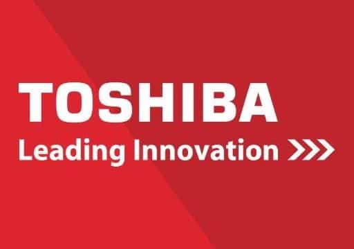
However, the company was still called “Tokyo Shibaura Denki” at this point, even though they went by Toshiba in the States and other countries. It wasn’t until the 1970’s when the group changed their name officially to Toshiba, and in 1984, it made the font more readable. In 2002, the Toshiba logo design was optimized for digital formats, and in 2006, the custom type-font was included with a tagline to update the corporate brand we know today.
![]()
What We Like About It
- It’s Readable: Sometimes, people think that fancy = better. Occasionally, this might be the case (talk to a designer!). The vast, vast majority of the time, fancy just makes something hard to read from a distance and even more difficult to convert seamlessly to the digitial format. These are both very important factors, and Toshiba is definitely easy to read and see from a distance. It’s simple, but we all know what it says (even though “Toshiba” doesn’t have any other definition in English).
- It’s Recognizable: If you were comparing this logo to another TV or technology logo, you would know it. You probably wouldn’t mistake it for Sony or LG. Even if this logo wasn’t red, you’d know it. Even if it didn’t have the arrows and tagline, you’d know it. For example – if we didn’t tell you, would you quickly remember which of these is the Pandora logo and which is the PayPal logo?
Yeah, that’s probably why Pandora got sued.
- Color: It wasn’t random when the Toshiba logo design was changed from black to red. Red is a powerful color in logo design in general, and companies like LEGO, Nintendo, and Adobe take full advantage of this fact. Toshiba sells phones, TVs, expensive high-ticket items, and red is usually used to encorage impulse purchases. Red is not associated with “calm” or “soft” like some colors – it’s a powerful statement when a logo is red. While this may feel manipulative from a consumer standpoint, it’s a good move for a tech company from a marketing stasndpoint.
What We Would Pass On
- Font: The only problem with the font is the spacing. While it makes it big and readable, the spacing makes it look like someone hit the space bar one too many times in between letters. It’s also a little dated, and could use a modern spin (though we don’t recommend changing the color!)
- Tagline: Again, this looks like it’s slapped on in Paint. Even though you can do some really cool things in paint, this is not one of them. Using a custom font for the name and not the tagline is an interesting consistency choice.
- We all recognize Toshiba at this point, and they take full advantage of that by simply refusing to include any technology elements at all. We would never know where they are “leading innovation” if we didn’t know they were a tech company and, heck, we’re still not sure what that’s supposed to mean. What at you innovating, Toshiba? And trust us, the pretty red font just makes us more impatient for an answer.
Our Take on the Toshiba Logo Design

So we kept the red, of course, because it’s a good color for a tech company. We even kept the tagline, but only because we changed the font to a more tech-y, updated custom font. We believe this makes it more clear that they are leading innovation within the confines of technology. Instead of using the arrows to indicate that they’re moving forward, we used them to symbolize the upward climb to success instead. Very, very recently, Toshiba actually split their main company into sectors that are independent of the “Toshiba” corporate. One of these new companies is “Toshiba Electronic Devices and Storage Corp,” and we think this update would be best for that particular sector, though it still works well for the overall picture as well.
The Toshiba logo design is an excellent update on the original design from the 80’s; it can only get better from there.