It’s important for a logo to stay fresh and current, and after twenty years of the same design, Equal has updated their logo.

Equal has stuck with their original color scheme using a similar light blue packet that we’ve all come to recognize, as opposed to say the light pink Sweet-n-low or the yellow Splenda rivals. Slightly changing their background to a more subdued and less popping blue, the new packets have joined the palette of the twenty-first century where less is more. Darkening the royal blue accent color, the colors allow for the pale background to be enhanced while still looking soft and healthy, unlike the neon blue showcased previously.
The font is the more noticeable difference, with thinner script letters allowing for a less bulky look and making the product seem more feminine and hopefully more appealing. Eliminating the fading dots above the brand name and switching the upper and lowercase mix of letters to only lowercase, Equal’s new logo features a younger and trendier brand. The simple script font allows for the removal of the curvy lines originally featured on the packets and though replaced by a rectangular background, the package does not look too rigid or symmetrical. The cursive lettering also represents a constant flow hinting perhaps, to the flow of the granules mixing seamlessly with the flavor of your beverage.
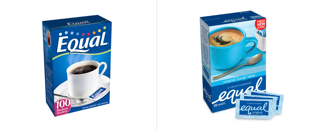

The individual boxes have also received an upgrade, now distinguishing between their three “flavors” with a color coded latte cup in pink, yellow or blue as opposed to the classic white cup featured before. While the colored cups are a nice idea, Equal falls short with the cups, reverting back to their love of neon colors from their original packets. The coffee inside the cups, however, is updated as well. No longer featuring a black cup of what could easily be the instant coffee your grandparents used to drink, the new saucers hold a creamy looking latte, with swirls of creamer being mixed in. The new drink can appeal to the brand’s loyal customers for twenty years, along with the new generation of coffee snobs so many of us have become.
But even with the changes, many believe Equal has still fallen flat. Their box design underwent the fewest changes and still represents the sweetener from the late nineties. While the packets do look fresher and more modern, there is nothing very interesting or clever about the new logo.
As one blogger suggested; same Equal product, Equally as boring.