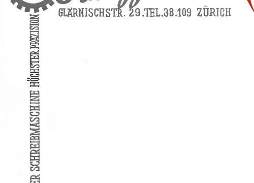
A great-looking letterhead can make a huge difference when it comes to promoting your brand, so investing in its design is definitely advised. If you choose, however, to proceed with designing your own business letterhead, here are a few things to keep in mind in order to make it as appealing, effective, and professional-looking as possible:
Simplicity
Keeping your letterhead simple doesn’t mean you lack the skills for something more complex. On the contrary, it suggests class, and shows that you know exactly what you want to get across. Make sure to keep your design clean and fuss-free, with a clear structure and an identifiable message.
Software
Using the right software when designing your letterhead is crucial, so invest in a professional design tool such as Photoshop. There are other alternatives, like InDesign or Illustrator. Do some research and browse the different possibilities when tracking down the right one for you. Your software should offer you plenty of options, be relatively easy to use, and respect your print supplier’s specifications.
Information
Your letterhead needs to be simple but attractive, while providing essential information about your business. Come up with a design that is informative and useful, and not just pretty or eye-catching. Be sure to include all the important details, like the name of your company, your direct telephone number and official email address.
Color
Although vibrant colors attract attention, too much color can have a negative effect on the reader. So focus on one small area where color is needed or could work well with your text. Instead of making your entire letterhead colorful, why not highlight one special part of it? This way, your letterhead can have the biggest positive impact on readers.
Positioning
Aligning your letterhead and positioning it properly is an art. The location of the letterhead is an important decision, as it will alter the composition of the page. Consider all of the options before settling. Does your stationery look balanced? Does it represent your business? Could it eventually get tiring to the reader’s eye or is it timeless and classy? The positioning of your letterhead should be well connected with the overall philosophy of your company, and compliment the other stationery promotion tools that your brand is using.
A final note when designing the perfect letterhead: pay attention to the size. If it’s too small, it will go unnoticed, and if it’s too big, it will occupy too much space on the page. Allow for enough empty space for the paper to serve its purpose, while making a statement that represents you and your brand.


