Images are everywhere.
In some ways, we are inundated with them. Not only do we see them while we’re browsing the net in the form of ads, logos, and friend’s BBQ pictures, we see them while we’re driving down the freeway on billboards. We see them while we’re shopping. We see them while we’re watching TV. Essentially, we see them everywhere, all of the time.
So it’s unwise to deny the power we see here. Images can make or break a business – well – image. They make you look rough and tumble, or sweet and caring. They make your business ready for new customers by deepening connections between your company and customers, or your imagery can make them move on.
So how do we use images in a positive manner? How can we add power to our companies using them?
Brand Imagery vs. Your Logo
Here at Logoworks, we do a lot of logos, and they’re definitely an important representation of your business. A logo can stand on its own to represent a company and is often recognizable all on its own.
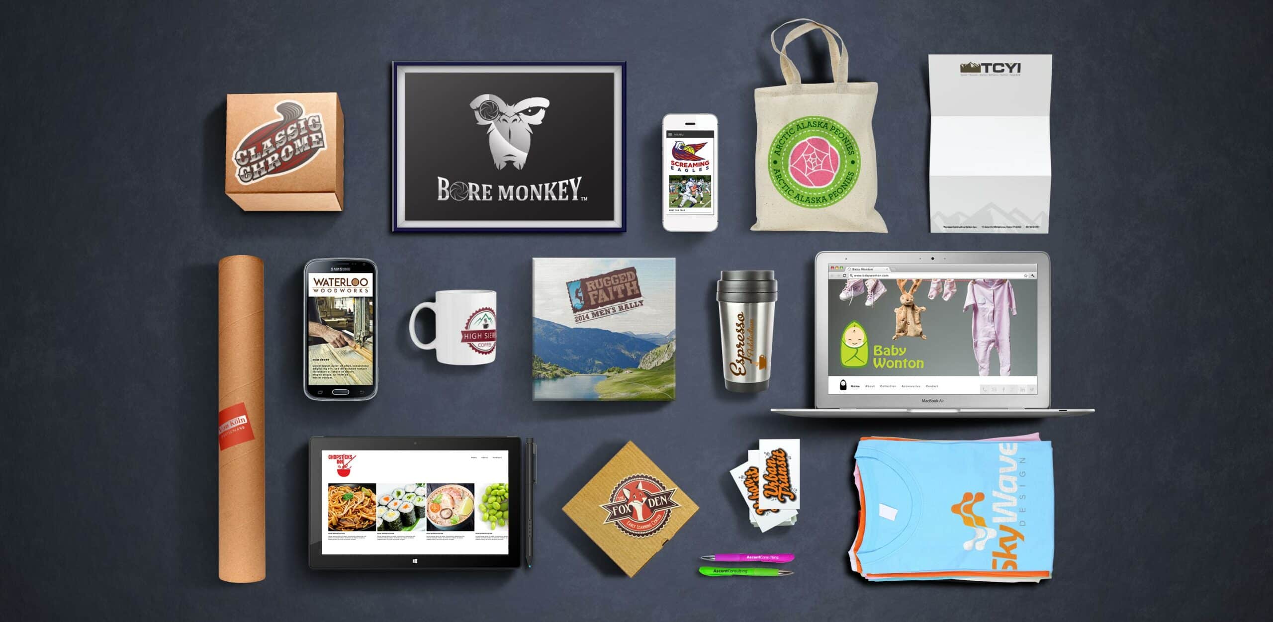
However, brand imagery is more of an overarching concept of brand aesthetic. While it often includes your logo, it’s much more than that; billboards, Facebook images, Facebook ads, Instagram, website, and even the literature and advertisements you do in print.
Brand imagery is a complex conglomeration of the images that make up the “feel” of your company. Your audience feels something when they start to look at your imagery, and hopefully, you know what those feelings are. Repeated exposure and consistency will build trust over time through these images. Quite frankly, we can’t write novels about what we want to say to our potential clients. So images are used instead by companies to let a potential customer that your company will solve their problem.
Step One: What Do You Want to Look Like?
Let’s take a look of Geeks on Site and Modern PC Repair, two companies in my local area that do computer repair.
In the world of break-fix, there are two imagery campaigns: geeks that know how to fix things because they’re geeks, and then professionally trained people who may or may not have a natural affinity for computers.
These two companies are selling the same hot dog, but they’re dressed very differently. Visualize the person who might choose a company like Geeks on Site. Maybe this person is also a geek, or someone who appreciates geeks or is married to one, and trusts them to know how to work on a computer since it’s likely they grew up working on them.
Modern PC Repair might be someone who does not trust a geek to fix their computer, or perhaps just likes the idea of a company with a more professional feel. Their computer will be pampered.
If you were either one of these companies, you would want to acknowledge and understand your competitor’s whole pitch, and who they are targeting. Then, you’d want to look at your own goals. What is important to your customer? What do they do every day? What do they need, and how do they want it? Set yourself apart in your imagery by really honing in on exactly to whom you’re selling.
But maybe you’re asking yourself how you could possibly sell the same product in the same town and succeed.
It’s all about the design of your imagery.
Color, typography, style, and sometimes content work together to create your entire feel. Think about what the colors and fonts you are using are saying. What is Geeks on Site trying to say with their colorful hat, their playful font, the colors that they chose? Dark colors wouldn’t have worked here – they convey seriousness and authority – and that’s not their target audience. Is it yours?
Learning lots about your target audience will help you choose the right imagery and will give you information that you can pass onto your designer.
Step Two: Stick with It
Of course, you don’t want all of your images to be identical. However, you do want them to look similar and, most importantly, feel similar.
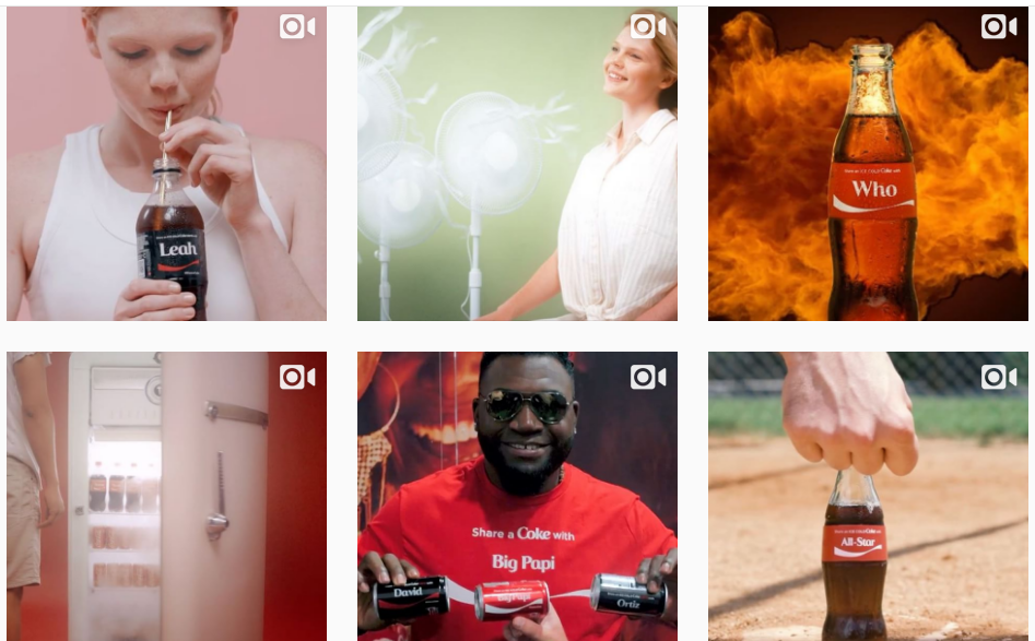
While the images from Coke’s Instagram aren’t identical, they all have the same feel – something to do with the “Share a Coke” campaign, and the home-brewed feeling that gives a person: grassroots, hometown, connectedness.
Once you figure out that imagery, stick to it. Get creative, but stick to it. If all of your images have the same feel, you can have some fun with the imagery itself. A coke bottle on the pitching mound, for example, is a great “we don’t expect a coke bottle there” picture, and will catch the eye of your audience.
Step 3: Familiarize Yourself with Successful Brand Imagery
While you can find a lot of success by yourself, familiarizing yourself with other brands that have had fantastic success with their imagery can bring essential knowledge you won’t be able to find on your own.

Let’s look at a fantastically interesting example. Brandless is, in fact, a brand of items that don’t have big names on them. Because the Brandless brand skips out on the well-known names, they advertise to skip out on the big prices, too, and only sell items on their website for $3. No more, no less.
The stuff that they sell is also made to make organic, eco-friendly items completely affordable, like this organic Grade A maple syrup. Spoilers: It’s $3.
Brandless is, in fact, a trademarked brand, and they have perfected the simple imagery of the items that they sell. They are simple and meaningful, which is something you would expect from a company that literally doesn’t sell anything that’s over three bucks.
As you can see, their images are all the picture of simplicity. They’re representative of the item that’s being sold, and that’s about it. From sugarcane fiber platers to organic peanut butter and recycled highlighters, Brandless has been very successful in making their brand imagery make sense for what they do and offer.
Maybe you don’t want to look anything like Brandless, but you can still learn a lot from how they represent their business.
In the end, you’ll simply need to keep the importance of brand imagery in mind, always keep on keeping on, and check out your favorite brands to see how they make the magic happen. Brand imagery perfection isn’t easy, but it’s certainly rewarding for you and your company.


