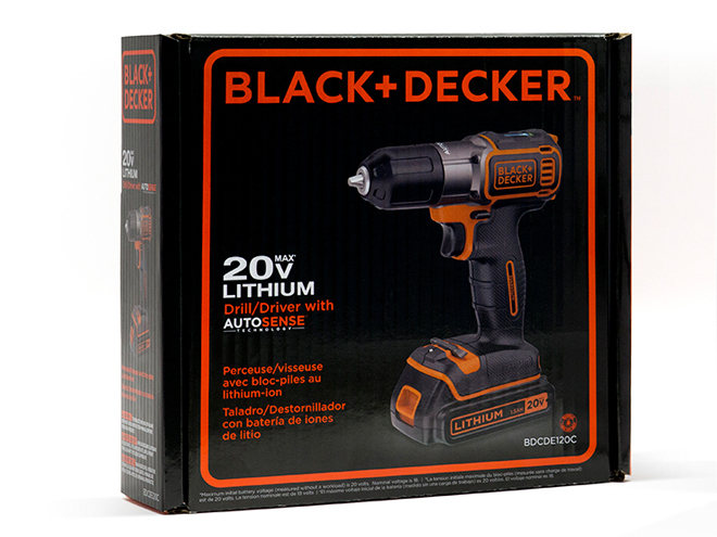
The words “Black and Decker” used to illustrate a tough man hard at work. Hunched over a plank of wood, the “Black and Decker man” would spend hours in his garage-turned-workshop hammering nails and woodworking in his flannel shirt and jeans. And when the company first launched in the early 1900s, that was their target consumer, but with their recent product line expansion, including items from electric tea kettles and citrus juicers to clothing steamers and landscaping accessories, the stereotypical brand needed some updating.
Black and Decker’s new logo features their new targeted customer, the well-rounded consumer. Ditching the heavy block lettering and the butch octagon, the new logo dons a more inclusive feel with its rounded border and simpler look. Lippincott, the consulting company responsible for the new design, focused on even the slightest details of the logo to help the company rebrand. The replacement of the ampersand with the plus sign offers a more inviting feel to the shopper. While the ampersand was classic, it merely linked two names together. The plus sign hints to the brand’s large array of products and numerous uses. Like the ampersand, the plus sign connects Black and Decker to one another, but also suggests to possibilities without limitations.
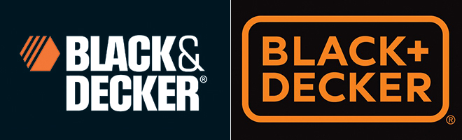
The spacing of the lettering is also a significant change. The vast majorities of new logos introduced this year have updated spacing and letting; thin is in and chunky lettering is being linked to the logos of the past. The new logo features “Black + Decker” written in a shorter and thinner font. Without the thick block lettering, the brand looks lighter, perhaps showing that it doesn’t take godly strength to lift their power tools or toasters. The added border with its rounded edges outlines the logo creating a modern overall feel and perhaps even goes as far as to symbolize the rounded array of items the company offers.
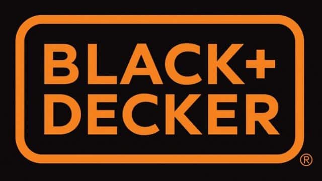
While basically every aspect of the logo was revamped, it does remain true to its original self and features the recognizable Black and Decker burnt orange color.
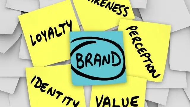
The new Black and Decker logo shows the power of a logo. More than just an update, their new logo shows Black and Decker’s overall re-branding of who they are, what they offer and who they’re looking to target. Ridding themselves of their old stereotype, their new logo illustrates the new direction the company has taken.