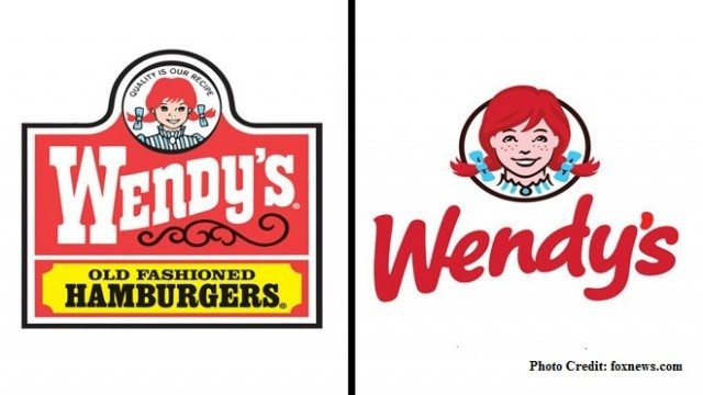
Just this past July, the web lit up with articles on a certain hidden detail in the new Wendy’s fast food chain logo. Many started speculating that the company slyly snuck the word “mom” into the Wendy character’s collar. But before we get into the specifics regarding this intriguing detail, let’s assess the redesign as a whole.
The new logo marks the fifth update for the brand, part of an overall rebranding campaign encompassing new store, uniform, menu board, and packaging designs. Wendy’s undertook extensive focus group research, collecting feedback on potential logos from customers and franchises, and kept coming back to three core brand components they deemed essential to keep in the redesign: the color red, the freckled Wendy character (based on founder Dave Thomas’ daughter), and the style in which the company name swerves upward (referred to internally as “the wave”). Research concluded that these elements were iconic, memorable, and that customers showed affinity for them. As a result, the new logo would mark an evolution—not a radical and complete transformation.
So the pigtailed Wendy remained, this time emerging with a faintly more grown-up appearance. Additionally, her pigtails come out of the circular frame, giving the character a bolder, more spirited presence. The textual component “Old Fashioned Hamburgers” was removed entirely, and one of the most sweeping changes came in the typographical realm. Now, the Western-style font has given way to a hand-drawn marker-style signature. The overall result is simplified and modernized—a vibrant upgrade with a clever awareness of its predecessor.
Now let’s dive into that apparent “secret message” lurking in the logo. Wendy’s Senior Vice President of Communications, Denny Lynch, offered the following statement of innocence to The Huffington Post: “We are aware of this and find it interesting that it appears our Wendy cameo has ‘mom’ on her ruffled collar. We can assure you it was unintentional.”
In any case, it’s clear that a new logo gets people talking and thinking about your brand afresh. The theorizing about subliminal messages in the new Wendy’s logo just goes to show that a redesign is one surefire way to generate buzz and renewed interest in your brand!


