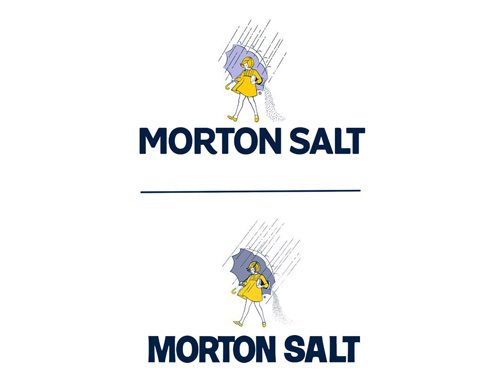
Just as the companies that they represent must grow and adapt to suit the ever-changing needs and desires of consumers, so too must logos evolve in order to continue to accurately portray the ideology of their corporate identities. Of course, not all rebranding is successful. Some attempts are indeed absolute failures. In our modern age of instantaneous communication through social media, poor attempts at rebranding are immediately apparent and face automatic repercussions, forcing some companies to reverse logo changes within months or even days. It isn’t surprising then that some companies are choosing to tweak their logos only slightly as the years pass, perhaps from fear of public backlash. For instance, the recent changes to the Morton Salt logo in January 2014 are hardly discernible. Seriously, if Morton’s public relations team hadn’t pointed out the changes, I might not have figured out what the differences actually are between the old logo and the new one.

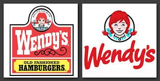
Wendy’s, however, chose to really revamp its logo, and the changes are clear, definitely giving the fast food chain a more modern vibe.
This infographic by New Glow Media illustrates the evolution of some major corporate logos over many years.


