Clever marketers and good graphic designers know that people can be subconsciously influenced. Some companies add subliminal images to their designs in order to further influence consumers or to simply make the logo more memorable. Here are five famous logos with hidden symbols.

Amazon’s logo not only has an arrow pointing from “a” to “z”, indicating all that Amazon has to offer its customers; that arrow also doubles as a dimpled smile, signifying customer satisfaction.
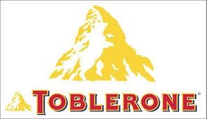
Toblerone has a dancing bear hidden in the negative space of the mountain. It is intended to be a tribute to the Swiss town where the chocolate was originally developed.
The FedEx logo forms an arrow between the “e” and the “x”, symbolizing the company’s efficiency.
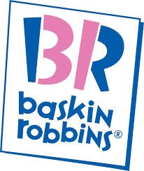
The pink parts of the “B” and the “R” in Baskin Robbins logo form a “31”, referring to the company’s famous thirty-one ice cream flavors.
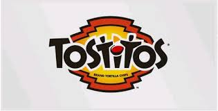
Tostitos has transformed the two “t”s and the “i” in its logo into friends sharing a bowl of salsa. Mmmm…..chips and salsa. This one isn’t subtle at all, but it’s effective none the less.

