Alright, you’ve done the hardest part; you’ve created your own business, and you’ve worked out every detail except for one. Now you need an incredible business logo by which people can recognize your brand. Whether you want to create your own logo or you want a custom logo design, you need to consider some of the characteristics that make a sensational logo.
1. Keep It Simple
Your logo should be quickly and easily recognizable. You want people to see your logo and immediately associate it with your brand. Too many colors or a complicated design is often distracting, and it can keep people from really connecting your logo to your brand in an instant. If people are required to think too long about your logo design, then it may prevent them from associating the design that you’ve created with your brand.

2. Make It Distinctive
Having a simple logo doesn’t mean that your logo should be boring. You want to have a really cool logo. In fact, you want your logo to be better than cool; you want it to scream the uniqueness that is your brand! You need to have a logo design that catches the eye and holds the attention long enough to leave a positive impression on the memory. If no one can remember who you are, then your logo isn’t working for you.
3. Keep It Focused
Creativity is awesome; however, you still want your logo to be appropriate to your brand. If you’re company sells cat food, then having a picture of a pair of shoes as your business logo really doesn’t make a lot of sense even if that pair of shoes is the most incredible illustration anyone has ever seen. No one is likely to associate that awesome logo of the shoes with cat food, so everyone will be saying to each other, “Hey, don’t you just love that awesome logo with the shoes?! What’s it for again? This makes a rather ineffective sales strategy.

4. Make It Versatile
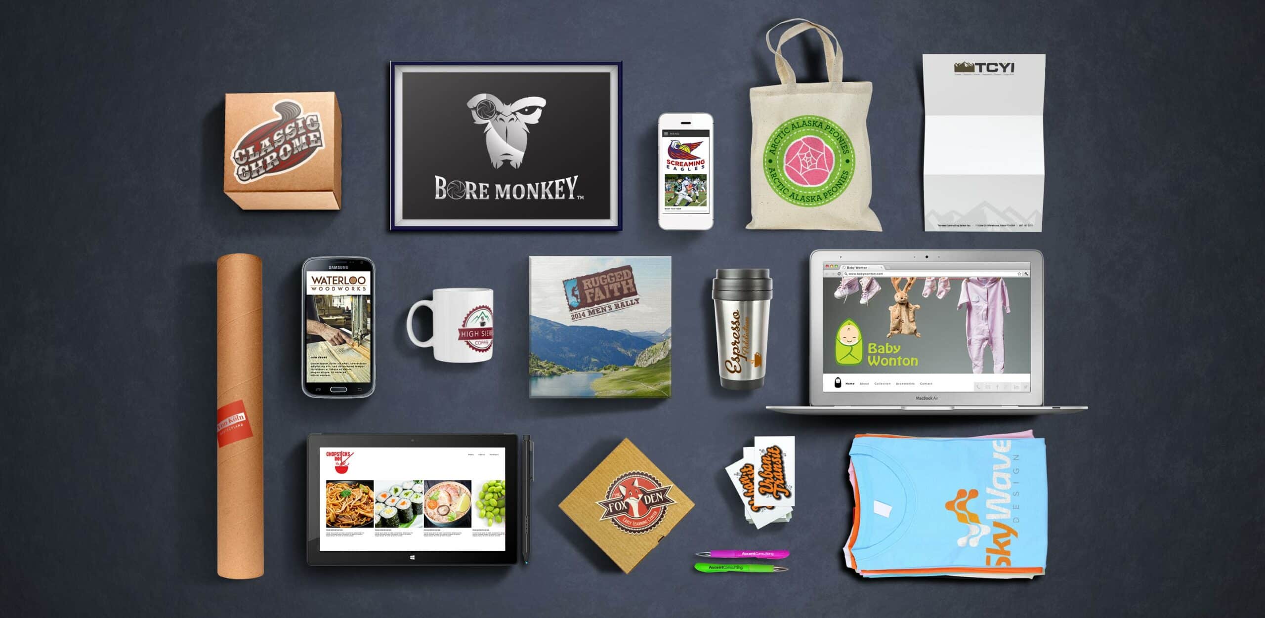
One of the most stupendous things about logos is that you can put them pretty much anywhere, on pretty much anything. Thus, your logo needs to be designed so that it can be used in multiple mediums. Will it look just as glorious embroidered on the small pocket of collared shirt as it will plastered across a billboard? I know that printing in color is prevalent, but what if your logo needed to be printed in black and white for something? Would it still look just as amazing, and still be just as recognizable, as it is in color? Keeping your creative design simple is definitely a major component of its ultimate versatility because your design must be easy for you to reproduce. From simple flyers and elegant business cards to t-shirts and coffee mugs, your logo is meant to be seen as many places as possible, so when you create your own logo, you should consider the plethora of places that you will want it to be able to go.
5. Make It Timeless
Yes, it’s great to be trendy, to be on top of whatever is the hot thing in pop-culture at the moment, but that’s the thing about trends; they’re really of the moment, and a moment later pop-culture has totally moved on to the next hot new trend, which makes your formerly trendy logo totally outdated. Do you want your brand to strike like a hot match and then burn out just as fast just like some one hit wonder of a song that you heard on the radio last year (who sang that again)? Probably not. You more likely want your brand to be remembered for a very long time to come, and if you want your brand to endure, then your logo needs to have a sense of timelessness about it. This doesn’t mean you need to create some boring, antiquated design. You simply need to create a design that will transcend the trends, that will still be relevant no matter what the hot new thing.


