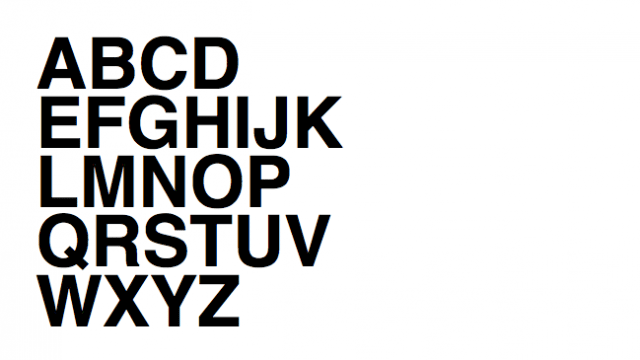
Helvetica has gained quite the reputation in the design community, and the lack of love for the font has been well–documented.
But just why do some designers hate the oft-used font? The question was recently posed on Quora and Slate reposted the answer by Quora contributor Stephen Coles.
Coles explains that his beef with the typeface is more so over its misuse than its actual design. When used as text or a user interface, the font’s tight spacing and uniformity pose readability issues. Moreover, he says, designers often blindly use Helvetica because of its “neutral” design without thinking much about context, which he defines as cultural environment, competitive products, format and medium. He also points to the overuse of Helvetica, especially by big box retailers, as another reason to avoid the font.
Coles does acknowledge the font’s redeeming qualities and examples of appropriate, even great, uses. But he says, like with any font, the choice to use it requires “proper research, testing, execution and good taste.”
[Slate]


