All kinds of creative combinations involving retro shapes, old-fashioned illustrations, vintage fonts, and sleek modern layouts are now being seen in the virtual world, giving birth to the most striking websites imaginable. Designers choose to display products, content, and services on cool online shops and glossy portfolios that adopt a reminiscent, vintage feel. Graphic elements that evoke the 1930s, 1950s, 1960s, and 1980s are placed in the same context as dynamic new trends, creating imaginative and engaging websites that really stand out. If you’d like to give your site a bit of a retro touch this season while keeping it modern and up-to-date, here are a few suggestions to get you started.
Add Shapes
Simple, fuss-free shapes can give your website the warm, evocative feel that may have been missing. Opt for circles rather than shapes with corners, and keep the textures soft and the borders playful (you may want to consider ornamental designs). Experiment with decorations as well. Why not fill your shapes with striped or floral patterns, putting them in contrast with the page’s separate background?
Opt for Vintage Colors
The earthier the colors, the more laid-back your website’s retro design feels. Limit your color palette, keeping it two or three tones. You can choose between mod or art deco color schemes and base your page on rusty oranges and yellows or off-whites and saturated browns. Add photo filters to adjust your images to the page’s old-fashioned color scheme, and make your lettering stand out by opting for a stronger shade of your palette’s primary color.
Update Your Lettering
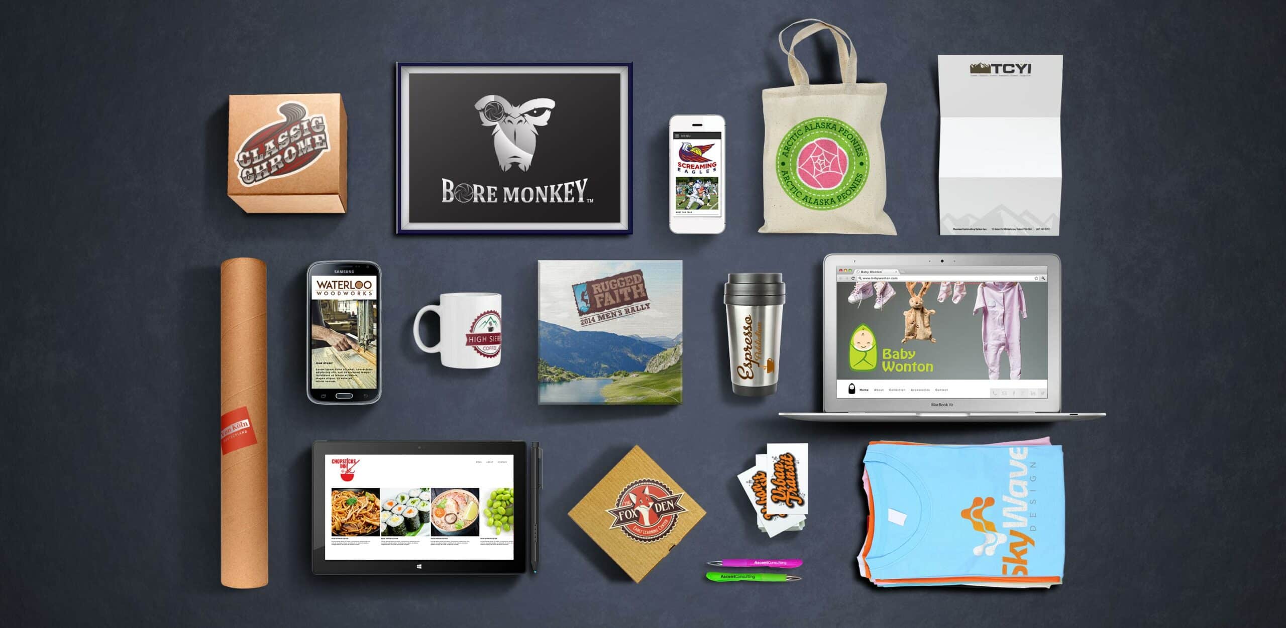
For a quick update to the “dated” trend, refresh your logo, fonts, and overall lettering. Simple techniques, like distressing your lettering’s textures, duplicating, or mixing handwritten scripts with your contemporary layout can greatly alter the feel of your page. Add flavor to your logo by updating its contrasting colors and perhaps opt for badges and banners of different sizes that bring back that beautiful ’40s and ’50s advertising and branding nostalgia.
Mix Textures
Mix and match different textures for the ultimate retro look. Keep some of your patterns light and worn out while making others really stand out. Blend artwork with romantic, pastel florals and keep your structures alternating from circular to linear and from brushes to stains. Add shadows, wrinkles, burnt edges, and distressed corners for a subtle used, vintage feel.
Adopting the retro effect does not mean that your website looks dated. On the contrary, blending some beautiful old designs with sleek, contemporary elements can craft a website that looks fresh and unique while bringing back old memories and giving off a warm, welcoming feel.


