The art of the business card is one long established by the professional market, and one that hasn’t seen a whole lot of evolution in the past decade or two. Generally, your professional business cards are not only your name and phone number, but a tiny, compact way to sell yourself. While there are a thousand ways to brand the card to make it look and feel more like “you”, a professional business card is still a professional business card: it’s your contact information on a piece of size-appropriate paper that you purchased in bulk so that you could hand them out to everyone you encounter.
Expectations of Conventional Professional Business Cards
The only problem with this is that people are used to being handed little cards with your stuff on them. At the end of a conference or what have you, they might have a hundred business cards to look at. That’s a lot of names and faces to remember. Even if you made an impression, it’s possible they won’t remember exactly what your card looks like. And when your card and everyone else’s card is all white with a logo and contact information on it, it can be hard to remember who’s who and what’s what. While professional business cards are still really important, people expect them. People collect them. People throw them away.
So besides making your card design fun and unique (which does cost money, but money well-spent), it can be difficult to really stand out in the sea of what has become professional business cards. That’s okay, though, because you can still do it.
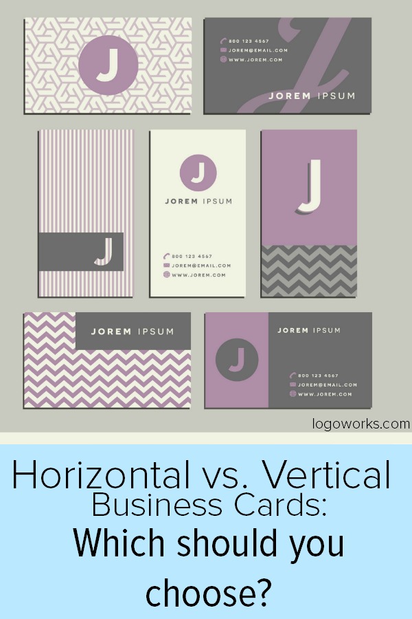
Being a Tad Bit Unconventional: The Vertical Professional Business Card
A potential client has received 45 business cards one day. They’re used to this, so they have a clip just for business cards. You come over to them with a smile, and you guys make a connection. You know that they could be someone you could do business with. You hand them a card; it looks like every other card they’ve gotten that day, but it’s vertical.
Hmmm, your client says, placing your card with the other cards they’ve collected for the day. That’s new.
When they get home at night, they thumb their cards and see yours again. It’s odd, but they like it. They check their email, and there’s one from you, checking in. They remember you immediately because of the card. You’ve made a connection – simply because of the orientation of your business card.
Getting people to take a second look at your business card is priceless. Making a mark on someone’s mind is important. You want to get remembered. Being remembered will mean that someone is more likely to do business with you – to take action – to do something that benefits both you and them.
Unconventional goes both ways, however. The problem with horizontal business cards is that some people just don’t like them. Change is hard. Some old hands (and some young ones) in the industry just don’t jive with the unconventional for the sake of it (if it ain’t broke, don’t fix it). If they carry a business card holder and they’re just casually flipping through, they’ll either have to pull the card out and flip it or turn their heads to see your information. While that isn’t necessarily a bad thing, it does mean that you could annoy someone slightly, and even a slight annoyance to someone can mean a disconnect.
The Power in Conventional Horizontal Business Cards
There is, in fact, tons of power in just going with the flow. We don’t orient books the way we do professional business cards, now do we? It would be weird and inconvenient and doing it just for the sake of being different would be silly. It’s much easier to read a book the way the vast majority of them are oriented, right? So there’s a reason to stick with what everyone knows, and instead create a unique selling piece instead of just a card with your contact information. If you can make your card sell in the horizontal position, then that’s awesome, and you should do that. You’ll just have to focus a lot more on the other elements of the card to make it stand out (and that is more than just background color).
Just remember, when in doubt, ask a designer. I know, I know. We say this a lot here, but it’s because this kind of thing really matters for your company. In the end, you might like both orientations and use both. Maybe you’ll decide conventional is the way. Or maybe you’re an artsy type, and a vertical business card with a design that stretches the whole card is more for you. Just don’t go without; always have your business cards ready for business.


