Engineering and electronics megacorp Philips has unveiled a new, updated logo inspired by the past, but functional for the future.
The new logo features a shield design with stars and waves that was first used in the 1930s. “The new shield,” a company rep explains, “is modernized for use in this digital age” and was “made to look more robust, visually impactful and easier to apply on digital platforms.”
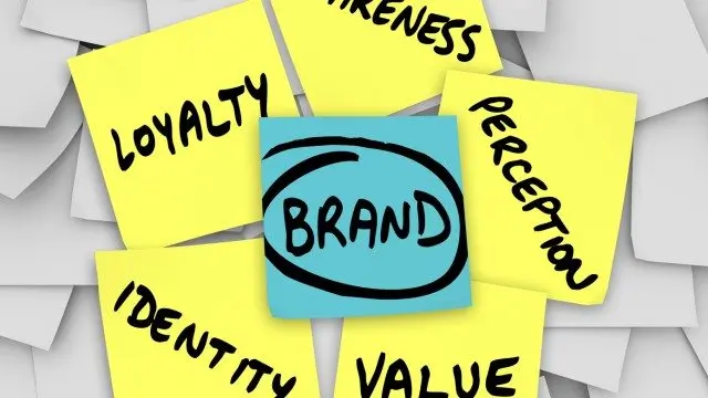
This last quality is especially significant. All businesses should now consider how their brand and logo translate on mobile. Whether your small business has a mobile website or a full-blown app, your brand identity needs to still be clear and make an impact on all digital devices.
See the complete evolution of the Philips logo, below. [Gizmodo, StockLogos]