Dear Dropbox,
Your name is literally Dropbox. You can’t literally take the box away.
Love, Logoworks
But seriously, the new logo just isn’t that good. In fact, we’d go as far as to say that not only isn’t it good, it completely defeats the purpose of their main purpose.
The New Logo & The Good
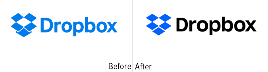
Here is a good comparison of the new vs. the old. The old logo featured a similar font (it is now Sharp, which is vastly superior), but as you can see, their friendly blue box is actually a box. This makes a lot of sense for the brand. It isn’t overly unprofessional, blue is comforting and warm in design, and being that Dropbox is a cloud service where you can drag and drop files from your desktop into the cloud folder, a box seems pretty appropriate, especially when paired with the name.
Dropbox has been around for a decade or so and has trumped many, many competitors along the way. An update to their logo isn’t necessarily a bad thing, and making it apparent that they are the same company that has won many-a-battle with other cloud storage services is also a good move.
Black is also another superior move. Black typeface here makes the whole logo pop way more than it has any right to (this is a good thing) and wouldn’t you want to pair your new jeans with a black shirt and not a denim one? Yes – because it gives the appearance of not being colorblind and, in addition, some class.
The…Questionable
We consider them a file-sharing-and-storing business. I think most people do. However, their goal has always been – in their words – “to be a technology company that builds simple, powerful products for people and businesses.” Okay, Dropbox. We see Dropbox Paper. We see that you are no longer a one-trick pony. But don’t act like your new tricks aren’t tricks that other companies have already performed, and performed well- Google Docs, we’re looking at you.
No one is ever going to see you as the “living workspace where people and ideas come together,” because we love you just the way you are, and already have spaces for collaboration.
So the new logo is supposed to be a “collection of surfaces,” and we suppose that means that all of these surfaces have to be the same size. And while the new logo is box-esque, it is far from being a box. Imagine trying to close that box. That doesn’t even work, guys. It is no longer a box, and most of your biggest fans pretty much wanted a box. And this new, sort of sleek design doesn’t go well with the new wacky branding.
Like, why the wacky branding when the logo was streamlined and made to look more modern and less friendly? It doesn’t make a lot of sense, and it’s kind of confusing.
Our Advice…
Dropbox, you can’t take advantage of all the current design trends. You just can’t. You have to go with one and make sure it makes sense for both your image and your company. Suddenly deciding to live up to your 10 year-old manifesto is a bad move. Expanding is good, but choose one way to expand. And keep the box.
We redesigned your logo for you. A couple of different ways, actually.
Option 1
So this option keeps the blue, drops the black, but adds some contrast tot he box to make up for it. Our designers see the box as more of a hammerspace in this version; many things can come out of it, because you’re not sure exactly where it ends. However, it is still very obviously a box. We like Sharp a lot, so we kept it. We even kept the big flaps here, because while they will absolutely never close, it gives it a cool sort of 3D effect, our designer said.
Option 2
This is recognizable because it is a box and has the same colors, and it looks ebough like the old box that people would instantly recognize it (as we learned recently, people’s memory isn’t great for specific logos, but general aspects of logos instead). However, there is still a way out of the box for expansion, space for you to think outside the box. In case you didn’t notice, it’s also a stylized D to indicate that this is all about Dropbox. This particular version also takes advantage of negative space, which is one design trend. One.