Listen, we’ve all seen really bad representations of brands with logos before. It isn’t uncommon. Sometimes a company tried to invent themselves and doesn’t use a designer, and sometimes a logo is just bad in general even when DONE by a designer (that’s why we recommend using a company who has MULTIPLE designers…). But since these designs are already out here, let’s make this a LEARNING OPPORTUNITY!
For these and more, take a gander at the Crappy Design Reddit – I promise you’ll either leave laughing or crying. Perhaps a newly minted alcoholic.
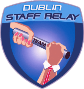
The infamous Dublin Staff Relay Tie-Hand
This logo isn’t all that bad…I mean, let’s…sigh.
It’s bad. The hands are poorly drawn. Even if this WAS done in a vector-creating program like Illustrator or Coral Draw, this is not a good representation of a drawing that comes out of that. In addition, the hands are creepy, poorly drawn, and while the concept is good, this is overly complicated and would print poorly on many mediums.
And of course there is a tie hand.
Oh, the tie hand.
There are many ways to make this hand masculine without the tie, but there are better ways to approach the idea of “team”. Making the entire logo less complicated and making the hands more neutral would have been a better choice, for example.
Oh! Boy Syrup
What’s…what’s boy syrup? I think what really makes this logo is the boy in a circle looking lovingly upon his sugary creation. I live on in you, boy syrup! Avenge my slaying for your deliciousness!
So I think the point is pretty obvious here. Why there is a cartoon boy looking down on a real image of pancakes is already beyond me, but the real lesson here is that punctuation really, really matters. You might think the oxford comma is dead, but it isn’t, friends – and neither is grammar. *adjusts nerd glasses* Spell check wouldn’t have caught this, but a second pair of eyes probably would have.
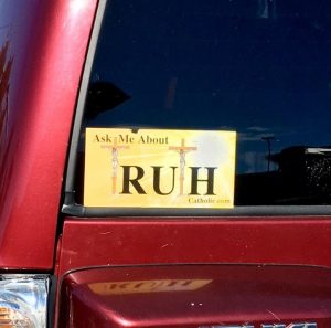
It’s all about the RUH, boy. The Ruh will set you free.
Including crosses in a Jesus-themed sticker isn’t a horrible idea…and a call-to-action is also not a terrible idea (that’s the whole “ask me about” bit). But if you’re going to use two different typefaces…don’t. Back up and call a designer because you get disasters like this when you start mixing typefaces and fonts without knowing what you’re doing. Everyone has Microsoft Paint, friend.
I am…I am going to let this one speak for itself, everyone. I don’t really think I need to do more than chortle for you to get the point.
I’m really done here. We have bad logos, and then we have “I’m not sure this is a logo” logos.
Don’t include strange orgy people in your logos and I think that would pretty much fix this entire logo or, at least, get it on the right track. There is just too much weird, unimaginable, hippie stuff going on here (see that oxford comma? THEY AREN’T DEAD).
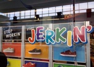
Stop Workin’ – Start Jerkin’
So I kinda get this. It’s a cute rhyme, and it’s at least readable. However, while the color certainly makes the word pop, it’s entirely inappropriate unless there are some kid’s shoes involved. I like rainbows just as much as the next person, but there’s just not a place where you should use them in the adult world of shoes. We take our shoes very seriously, dang it. We should have pretty brands so we can feel good when we’re walking around wearing our $15 Eagle Eyes or Diamond Shoes.
Oh, and then there’s the fact that the word is “Jerkin'”. Which just does not have any positive connotations in the world, much less the shoe world. Don’t use it.
Stop thinking about it.
Don’t use it.
That’s a lesson, right?


