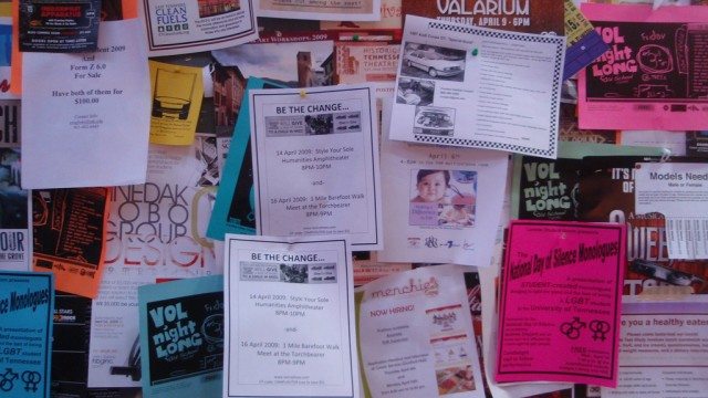
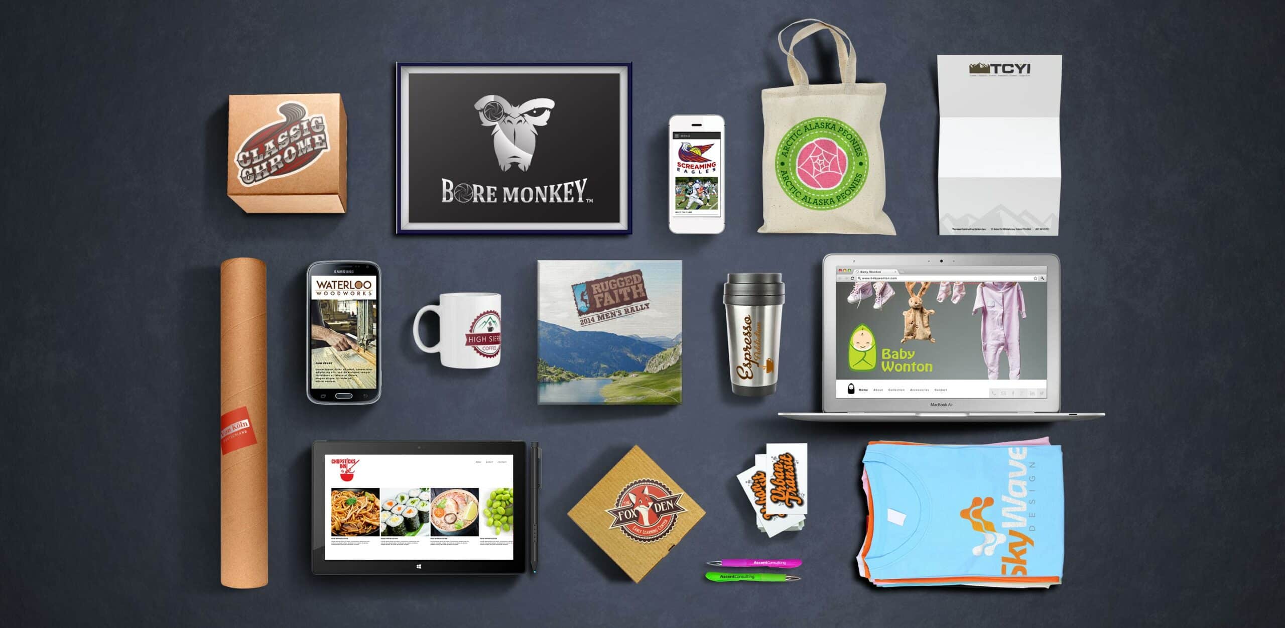
How many times have you been handed a flyer that seems to have been designed on the spot and doesn’t take into account the business it represents or the audience it addresses? Unfortunately, companies often forget how effective a marketing tool an attractive flyer can be. Here are the most important points to remember when designing a great flyer for your business:
Headlines That Pop
The most important thing to remember when putting together an effective flyer is the headline. A strong headline summarizes your business’ goals and philosophy, directly addresses your target audience and gets straight to the point. While doing all this, it should be attractive and eye-catching to make the reader want to know more.
Graphics That Sell Themselves
Use your graphic design skills to draw attention to your brand. You don’t have to come up with many images, just one or two that force your reader to look at them will do the trick. Careful image placement on the flyer and text positioning around the image will go a long way in helping you get your message across. Choose high quality graphics with strong colors and arrange them vertically. If you can set your Word document to suit the size of your flyer, this will make the design process even easier.
Well-planned Content
Make sure you identify what it is that you’re trying to get across right from the get-go. Once you have established what the main points of your flyer will be, organize them in a way that makes it easy for the reader to get all the important information with just a quick look. To structure your content effectively, you don’t need long lists of bullet points or an over-formatted array of boxes and arrows; instead, opt for different font colors and sizes that make your text stand out.
Clever Alignment
When designing your flyer, consider the layout carefully. Add margins and plan your content and graphics using a Word table first. Be sure to allow enough empty space for your words to breathe, and don’t overload your flyer with so much information that it looks messy. Keep it clean and fuss-free.
Conclusion
Always keep it simple. A personal, engaging and clean flyer goes a long way, so keep it harmonious and strike a balance between content that speaks and design that attracts. Done right, flyers can prove to be one of the most effective business boosters available to your company.
Sources:
http://www.artworkabode.com/blog/key-elements-in-effective-flyer-and-brochure-design/
http://www.printaholic.com/15-tips-for-writing-effective-flyers/


