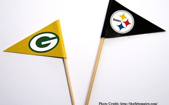
Recently, we examined the logo design history behind two Major League Baseball team logos. Now that the football season is underway, it only seems appropriate to turn our attention to the NFL. So let’s take a closer look at two National Football League team logos.
We begin with the only team to include their logo on just one side of their helmets—the Pittsburgh Steelers. The story of the Steelers’ 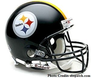 logo is very much a story of product placement. Back in 1962, Cleveland’s Republic Steel Company approached the Steelers, a team based in a city associated with the rise of the steel industry, about using the Steelmark logo on the team’s helmets. The Steelmark logo, co-owned by Republic Steel, belonged to the American Iron and Steel Institute and was created by the U.S. Steel Corp. to promote steel and its manufacturers. According to the 1960 announcement of the campaign, the logo represented “the modernity, lightness, and stylishness” of consumer products made of American steel.
The football team appealed to American Iron and Steel Institute to change the word “steel” written in the logo to “Steelers” for the team’s purposes, and when their request was granted, the football team’s logo was complete. To infuse fresh energy into the team for the postseason, they changed the color of their helmets from gold to black. The color change also served to highlight the new logo, and they’ve left the design untouched ever since.
Shuttling deeper into the Midwest, we now turn to the Green Bay Packers. The team’s dark green, gold, and white “G” logo—the only 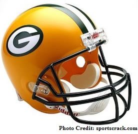 one to ever grace their helmets—was introduced in 1961. Packers coach Vince Lombardi called upon the team’s equipment manager, Gerald “Dad” Braisher, to develop an original design for the logo. He worked on the logo by night at home in his hotel room in De Pere, Wisconsin, and often ventured downstairs to the bar to show sketches of his work-in-progress to the hotel owners .
According to a Milwaukee-Wisconsin Journal Sentinel article on Braisher, he didn’t intend for the “G” to refer to the team’s location but rather to stand for “Greatness”—and his aim was to fit the “G” into a football shape. John Gordon, an art major and Packers intern who assisted Braisher in his equipment manager duties, offered some final logo design support. The Packers’ “G” has inspired a good share of copycats in the high school and college sports world, including the University of Georgia and Grambling University, only reaffirming its iconic status.
It all goes to show that the roots of logos lie in all manner of places, finding their inspiration from the towering marketing department of a great American industry to a humble hotel room occupied by a team’s equipment manager!