The city of Raleigh, NC has acquired a new brand identity, and naturally, things got awkward the minute it was released via Tweet.
In general, when logos change on the Internet, everyone has an opinion. Over time, everyone adjusts as the logo becomes commonplace. That doesn’t mate the initial commentary any less funny.
TIL that Raleigh is now known as The Artichoke City. https://t.co/nNTDD4BnPf
— Brian Murphy (@btmurphy88) November 8, 2017
From Artichoke City to Windows 95, the Raleigh logo critique has been varied and amusing. At least it’s stirring up some attention; for $226,000, it better. However, considering we see logos every day in everything we do, maybe it isn’t an unjustified 200k.
Design Principals
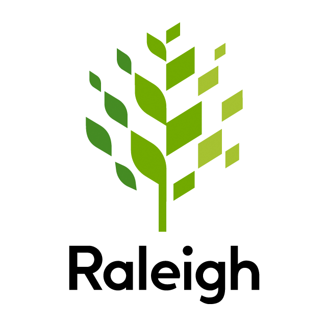
So Raleigh has a whole tree motif, and for a long time, they’ve used an oak tree as a seal on official documents. This definitely looks like a tree, and the coloring is reminiscent of the coloring the city uses in their branding, which is a yellow-and-green design. In this sense, we think Raleigh has done well in creating a more cohesive image of itself. In the launch video, an in-play showing of the logo reveals that the logo is intended to be half-tree, half-building. While the logo’s symbolism may not be clear upon first viewing, once you know, it does make sense; leaves represent the tree, and quadrilaterals represent a less natural, more man-made structure, such as a skyscraper or road. The word “Raleigh” is also clear, easy to read, and well-balanced with the oak above it.
For design principals, our Raleigh logo critique decision is that the designers did a good, thoughtful job.
Functionality
The only concern we have here is on print material. This logo is taller than their original logo by quite a bit, and as they rebrand their materials, they can’t just switch out the old logo with the new; they’ll have to adjust both the material and the logo until both look right. Without warping the logo, this can be a difficult task for amateurs. Beyond this, the logo is quite easy to reproduce; the colors are easy, the logo is simple and does not have things smushed too close together to come out nicely on paper, and a greyscale version would be charming.
Audience
The audience for this logo is two-fold: first, the citizens of Raleigh will become familiar with this logo as it appears on signs, shirts, branded materials, and business cards and second, tourists will see this logo on attraction websites and additional branded materials. For the citizens, the reason the logo was so expensive was that Raleigh hired a team of marketers to research what local residents wanted, so the overall reception in the town has been positive. This is a modern, geometric logo that should appeal to a wide tourist base. Perhaps it won’t be memorable, but it won’t be offensive, either.
Typography
The letters are evenly spaced, bold, easy to read, and simple. The “l”, “i”, and “h” are all perfectly even, and the “g” doesn’t swing down too much, which would make it even wider and more difficult to put on print. Overall, we approve the typography and see no room for improvement.
Possible Improvements
We don’t see a lot of necessary improvement here; it is what it is, and we don’t really think there’s much to be changed. The only concern is the height, which could easily be solved by simply having a smaller, compact version to brand city materials with when this logo didn’t fit. This could be a small round emblem that showed a clip of the tree, or perhaps a stylized “R” with some of the oak leaves. Either way, this is a great, balanced logo.
[mks_pullquote align=”center” width=”300″ size=”14″ bg_color=”#1e73be” txt_color=”#ffffff”]Make a wordmark or emblem to use on materials that cannot incorporate the entire tree easily.[/mks_pullquote]
Our Raleigh logo critique is positive. Overall, we see a good logo design that may or may not have been worth over $200,000, but will be a solid foundation for the city for decades to come.


