Every graphic designer who’s taken formal coursework knows a little bit about typography. They’re probably familiar with the basics, like how serifs on letters can decrease readability, and the importance of contrast between text and background. However, user experience experts are beginning to place an increased focus on the role of typography in Web design and creating a positive user experience.
As the AddThis team highlights, “Typography plays a big role in great user experience.” The readability of text is just one component of how humans perceive and interact with websites. Typography styles can also evoke emotion in viewers and affect their perception of a brand, which is why font styles are typically included in branding guidelines.
For both typography newbies and enthusiasts, here are a few major trends in fonts and text to pay attention to.
1. Delicate Scripts
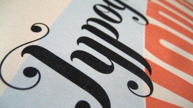
Could you design an entire website with the delicate, thin, looping scripts that are back in style in a big way? It’s unlikely. However, for emphasis or headlines, this trend can be an attention-grabber. Think of some of the best delicate script fonts available, like your Grandma’s handwriting, only neater.
2. Dramatic Typography
Thick block letters. Huge font sizes. Sans serif fonts that literally demand your attention and don’t let go of it. The recent trend toward serious drama in typography means that Web developers don’t need to be shy about making headlines and page titles really bold.
3. Mix-and-Match Fonts
If you’re a typography fanatic, why stop with just one font? Mixing and matching font styles within a single Web page has been rising in popularity for some time, and this trend shows no signs of stopping. Most designers opt for mixed fonts that are similar in style to maintain cohesive messaging. However, bolder mixing can look creative and enticing.
4. Handwritten Fonts
It goes without saying that there can be an incredible amount of variation in handwritten fonts, from messy scrawls to near-perfect cursive. Custom or pre-packaged fonts that resemble handwriting can add a human dimension to a brand. Provided they’re readable, they can make website text appear familiar and comfortable.
5. Back to the Basics
Sometimes, the boldest statement of all with typography is no statement at all. Remember the days when basic fonts like Helvetica reigned supreme? Opting for classic fonts free of surprise can communicate professionalism and even a sense of minimalism, creating a very clean-looking website.
Are you a typography fanatic? What are your favorite 2015 trends?


