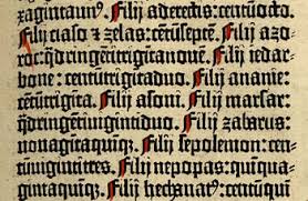
While humans had been writing manuscripts for centuries, the first movable type printing press is credited to Johannes Gutenburg, a German printer and publisher, around the mid fifteenth century. Gutenburg created a process that allowed for the mass production of typed material, which made printed books far more economical for both the publisher and the public. This essentially revolutionized printing in Europe.
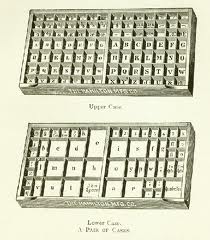
Gutenburg modeled his wooden printing press after the agricultural screw presses of the time period. Single, hand cast, metal alloy blocks were set in a movable hand press, ink was rolled over the raised surfaces of the letters, and then the wooden form was pressed against a sheet of paper. Originally, the letter blocks of the typeface were stored in two cases, the upper case and the lower case, which are designations that we still use. He fashioned his letters in the popular hand written Gothic Blackletter style of the period.

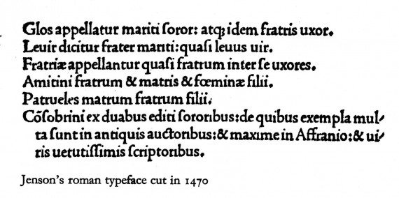
By the late fifteenth century, Gutenburg’s press had spread to Italy, and while the German typefaces remained heavy and Gothic in style, the Italian typefaces took on a new look courtesy of Nicholas Jenson. Jenson purposefully created a typeface that did not look like handwriting. It was more slender and upright than the German styles.
In the early part of the sixteenth century, Aldus Manutius and Francesco Griffo created the italic typeface. The capital letters were still upright; however, the lowercase letters were smaller, slanted to the right, and more condensed, resembling the cursive writing popular to the humanist Renaissance. This more compact style allowed for the printing of smaller, pocket-sized editions of books. I don’t know about you, but even in our modern age, when we can carry computers everywhere with such ease, I still really love being able to fit actual printed books in my pocket.


